光是一种能量的形态,在设计中,光是表达情绪及引导空间的重要媒介。点烛照明设计是一家专注于灯光设计的品牌,未知营造受品牌主理人委托,设计其位于广州罗浮宫的展示空间。灯光展厅与其他产品展厅有别,它需要的,是创建场景,是让人们沉浸其中,随着灯光的变换体会不同的情绪变化,感受光给空间带来的能量。Light is a form of energy. In design, light is an important idea to express emotions and guide space.DianZhu Lighting Design is a brand that focuses on lighting design.Undefined Builder was entrusted by the brand manager to design its exhibition space in the Louvre Museum in Guangzhou.The lighting exhibition hall is different from other product exhibition halls. What it needs is to create a scene and let people immerse themselves in it. With the change of light, they can experience different emotional changes and feel the energy brought by light to the space.
基于对品牌的思考,未知营造打造沉浸式灯光体验场景,让灯光设计与空间融为一体,增强游览者的体验感。同时,通过反差与冲突的设计手法,呈现空间戏剧化的叙事。Based on brand thinking, Undefined Builder create an immersive lighting experience scene, integrate the lighting design with the space, and enhance the experience of visitors. At the same time,through contrast and conflict design techniques, presenting a dramatic narrative of space.
Mystery Prologue神秘序幕-空间的原始结构是一个狭长的长方形,规矩且缺少趣味性。若按照传统的水平和垂直比例进行切割,本不宽阔的空间更显局促。
设计师刘雨希望空间更具值得深入推敲的趣味性,继而从荷兰艺术家埃舍尔的创作中找到项目灵感来源,通过曲线与体块分割,营造出具有神秘视觉感的游览动线。The original structure of the space is a long and narrow rectangle, regular and lacking in fun. If it is cut according to the traditional horizontal and vertical ratios, the space that is not wide is even more cramped.Designer Liu yu hopes that the space will be more interesting and worthy of in-depth scrutiny, and then finds the source of inspiration for the project from the creation of Dutch artist Escher, and creates a mysterious visual tour line through the division of curves and blocks.
“埃舍尔的凸与凹画作展现了空间块面的弯曲和切割,为观者带来迷人的视觉体验。他的作品经常采用形状渐变、几何体组合和光学幻觉等特色元素,这为我的设计提供了许多灵感。在设计中,我也尝试融入更多独特的理念,希望能够使这个空间更加别具一格。”设计师刘雨如是说。
"Escher's convex and concave paintings show the bending and cutting of spatial blocks, which bring the viewer a fascinating visual experience. His works often use characteristic elements such as shape gradients, geometric combinations and optical illusions, which are very important for my work. The design provides a lot of inspiration. In the design, I also try to incorporate more unique concepts, hoping to make this space more unique." Designer Liu yu said.
Playful Contrast
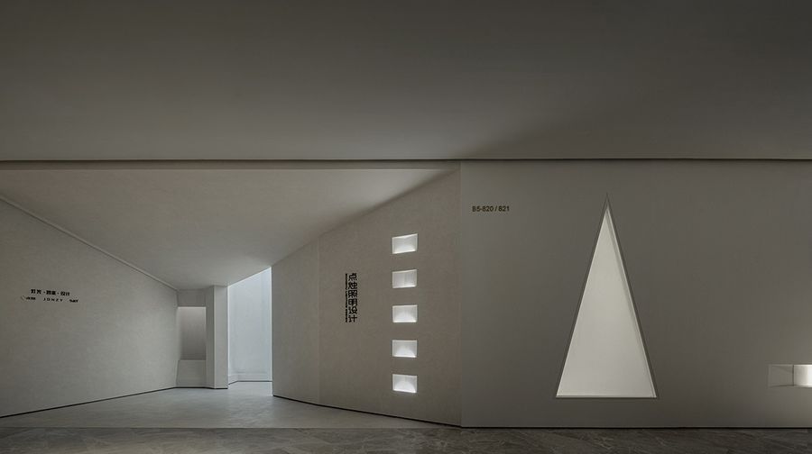
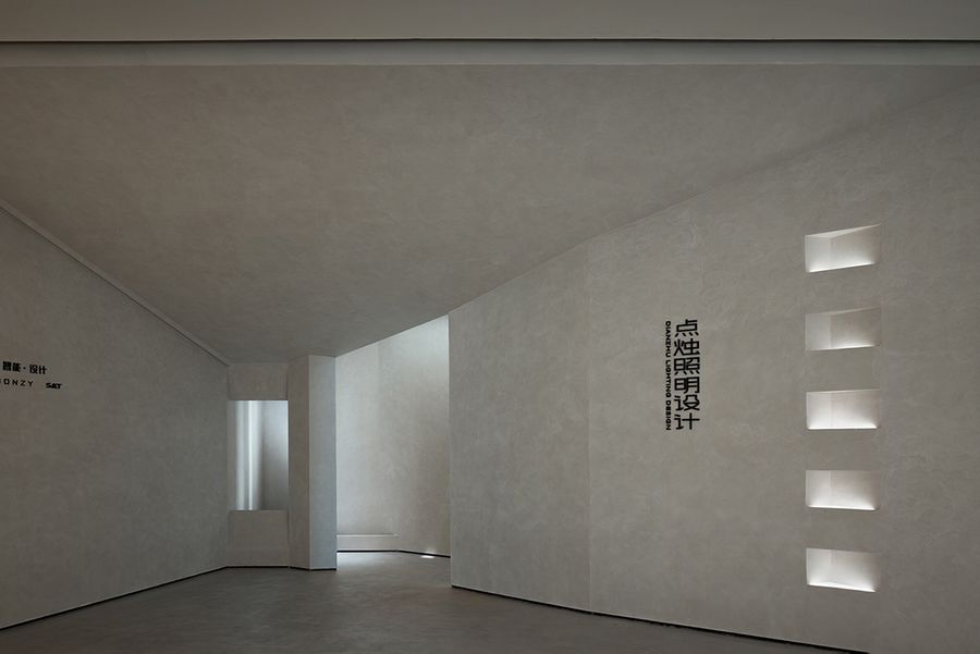
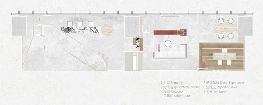
玩味反差-入口采用斜角的切口处理方式,旨在让游览者能够逐步感受到空间的收敛。同时,在对外的设计上,稍微大胆地舍弃了一部分展厅空间,采用了一个退台设以增加展厅的纵深感。
The entrance is treated with an oblique cut, designed to allow visitors to gradually feel the convergence of the space. At the same time, in terms of external design, a part of the exhibition hall space was boldly abandoned, and a setback was adopted to increase the depth of the exhibition hall.
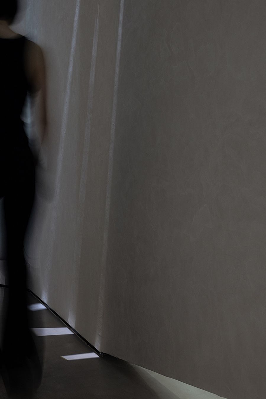
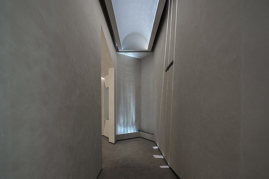
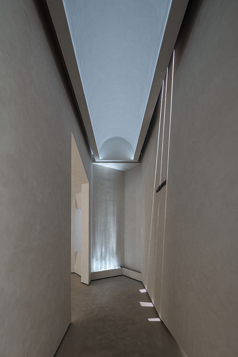
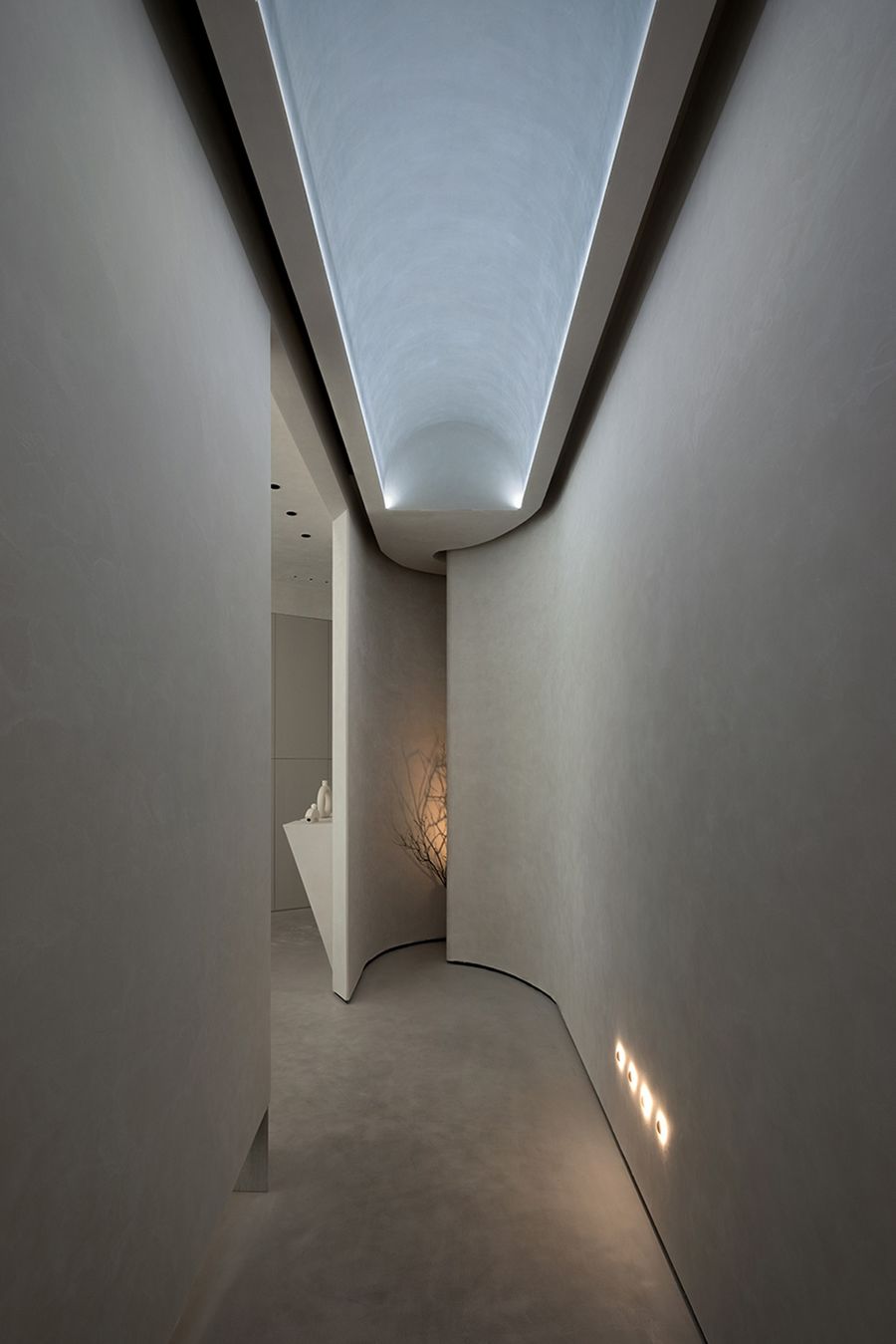
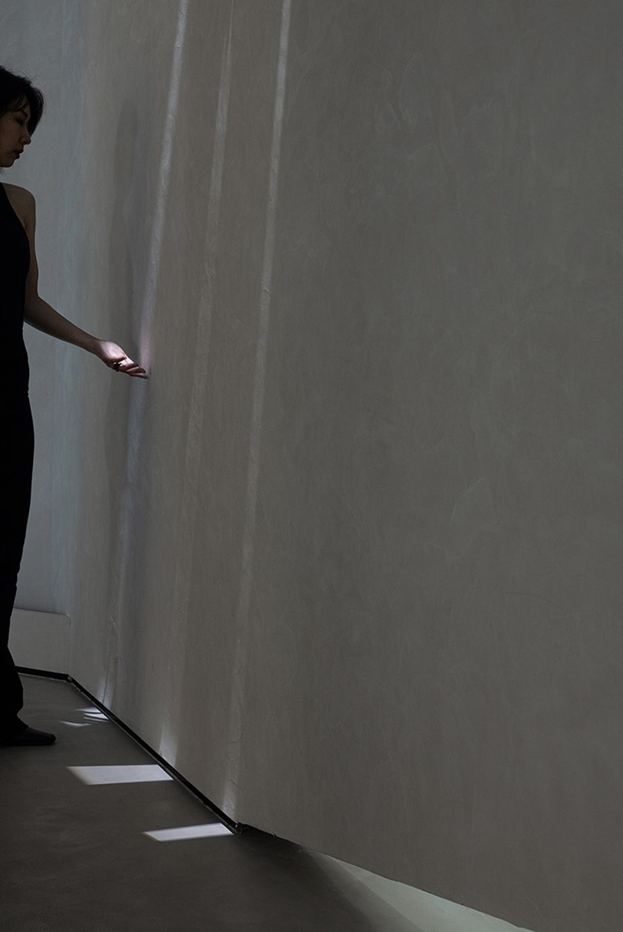
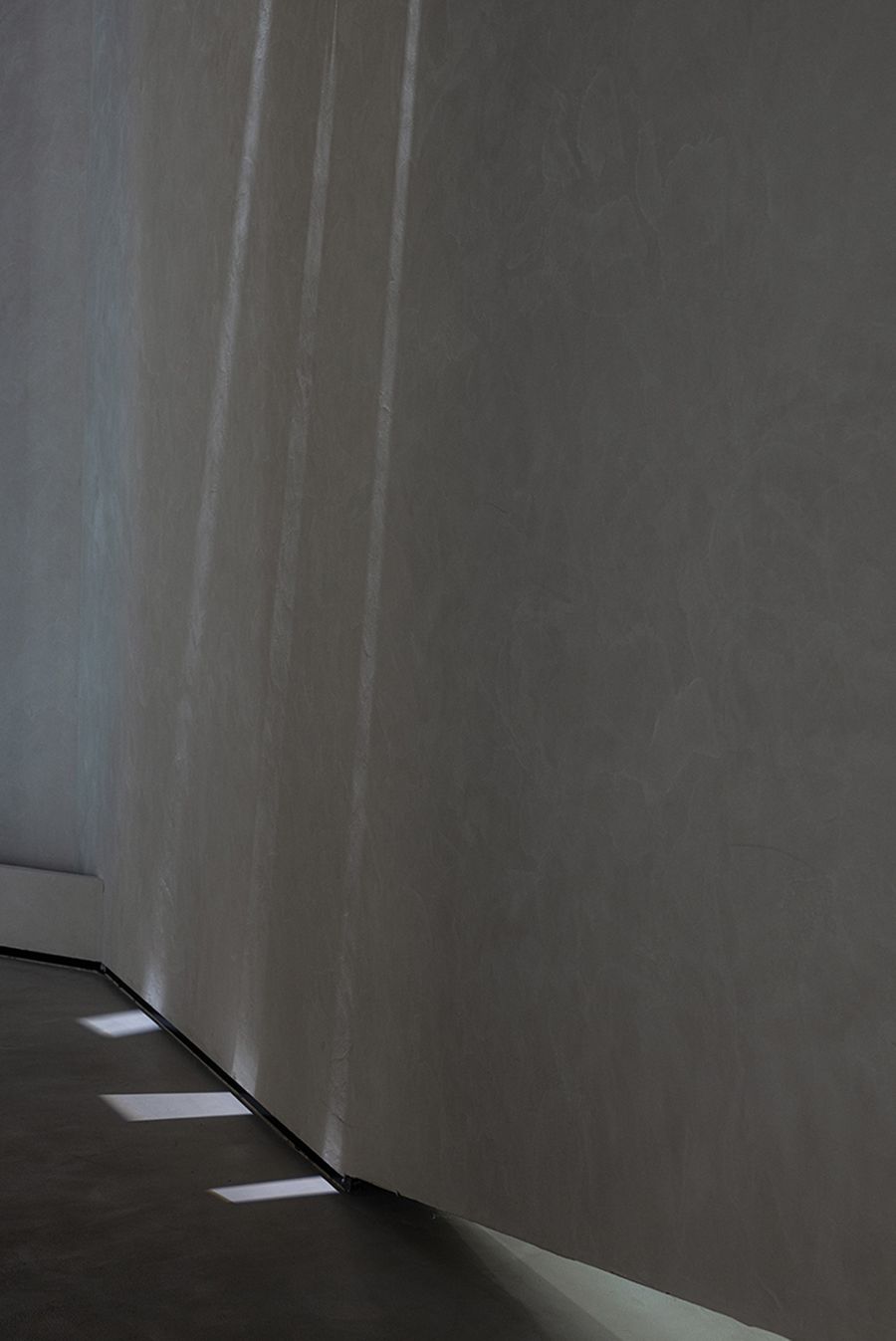
一旦正式步入展厅,人们便置身于设计师精心打造的"光影走廊空间":树影摇曳,水的倒影,模拟的自然光影,构成简洁却极富美感的画面。天花采用轻盈的弧形造型,与之形成鲜明对比的是从切面空间到直线的弧形空间转变,由窄变宽,由低变高,放大空间场景的反差感。Once entering the exhibition hall, people will be in the "light and shadow corridor space" carefully created by the designer: the swaying tree shadows, the reflection of water, and the simulated natural light and shadow form a simple but extremely beautiful picture.The ceiling adopts a light and curved shape, which is in stark contrast to the transformation of the curved space from the sectional space to the straight line, from narrow to wide, and from low to high, magnifying the contrast of the space scene.
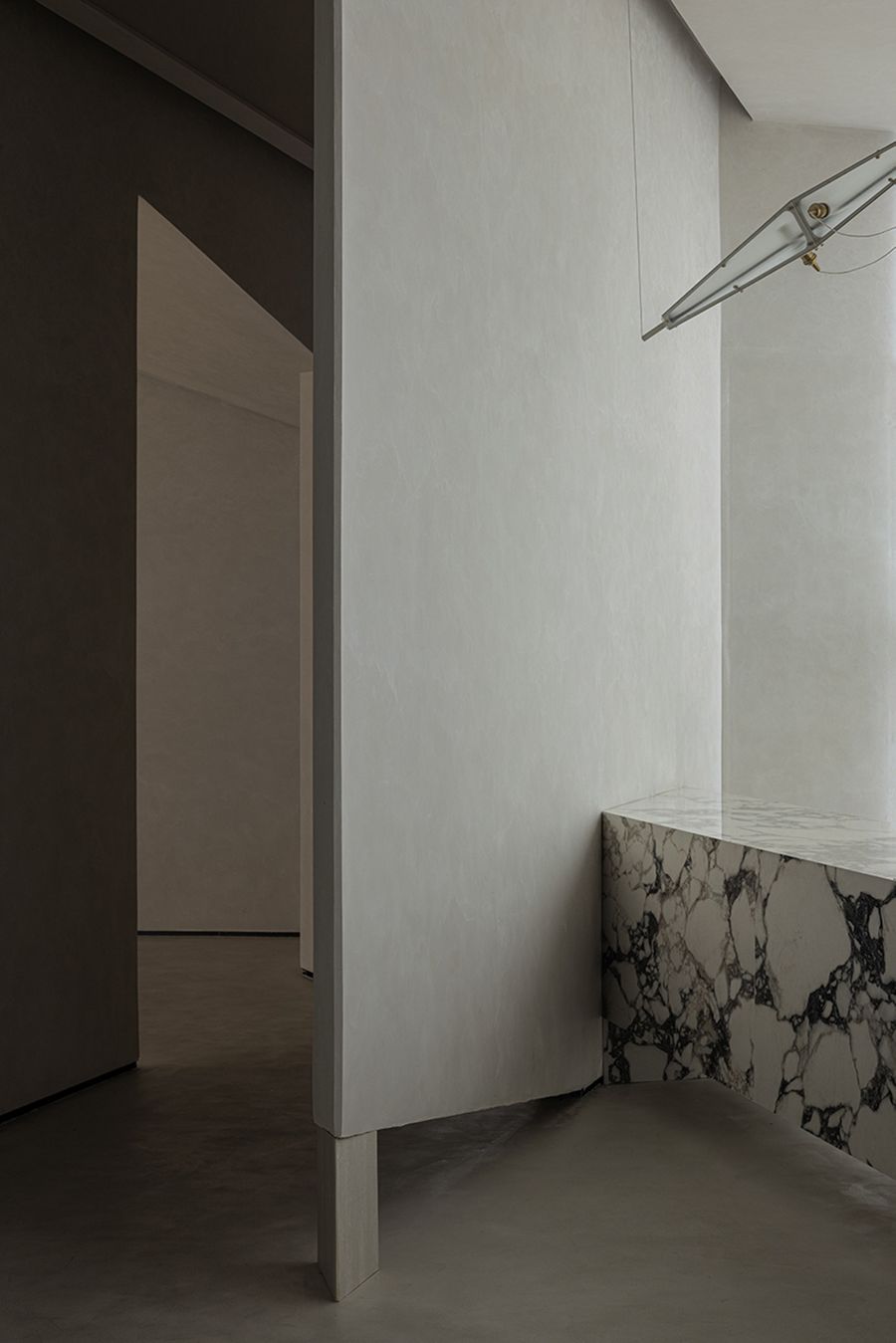
设计师刘雨喜欢为设计添加一些有趣的细节。"光影走廊空间"和办公区的过渡,在呼应入口的斜角设计的同时,隔断墙底下也进行了挖空处理,以营造轻盈的空间感。来访者还未到达空间,其踪迹已通过缺口被捕捉,从而带来有趣的体验。
Designer Liu yu likes to add some interesting details to the designs. In the transition between the "light and shadow corridor space" and the office area, while applying the bevel design that echoes the entrance, the bottom of the partition wall is also hollowed out to create a light sense of space. Visitors have not yet reached the space, and their traces have been captured through the gap, thus bringing an interesting experience.
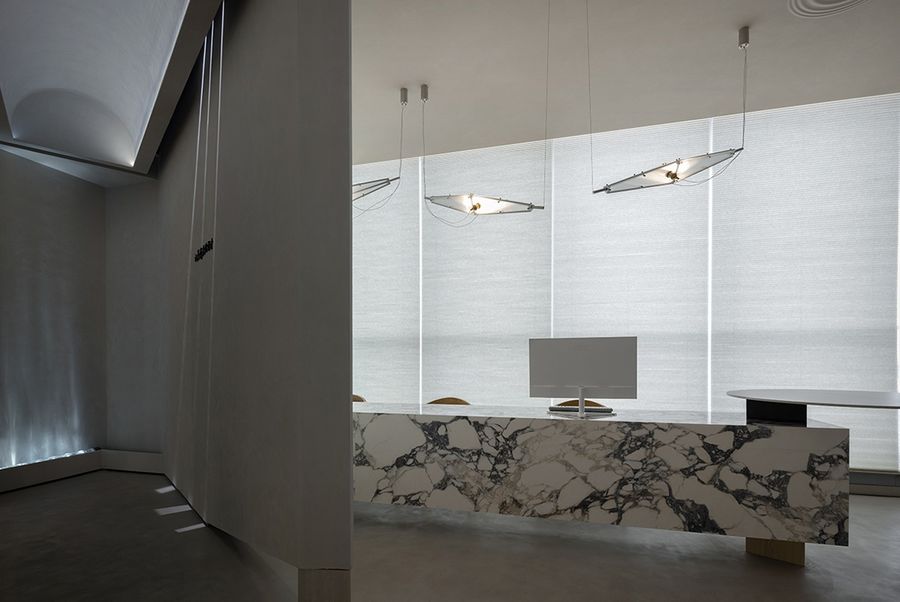
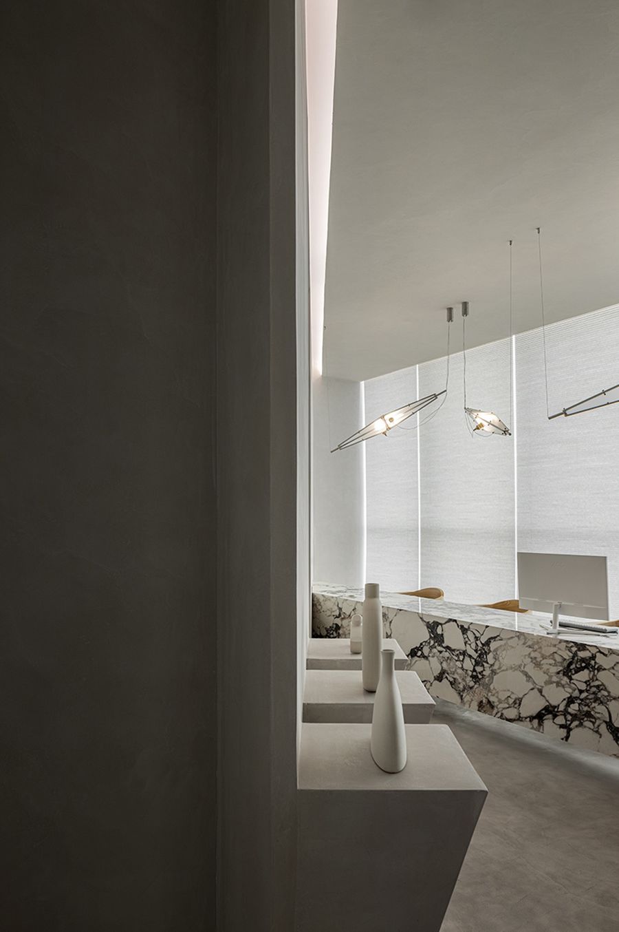
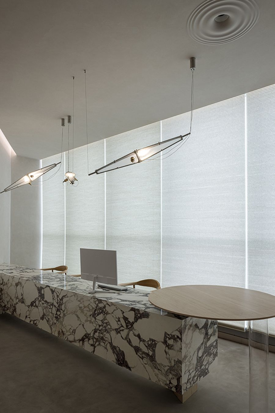
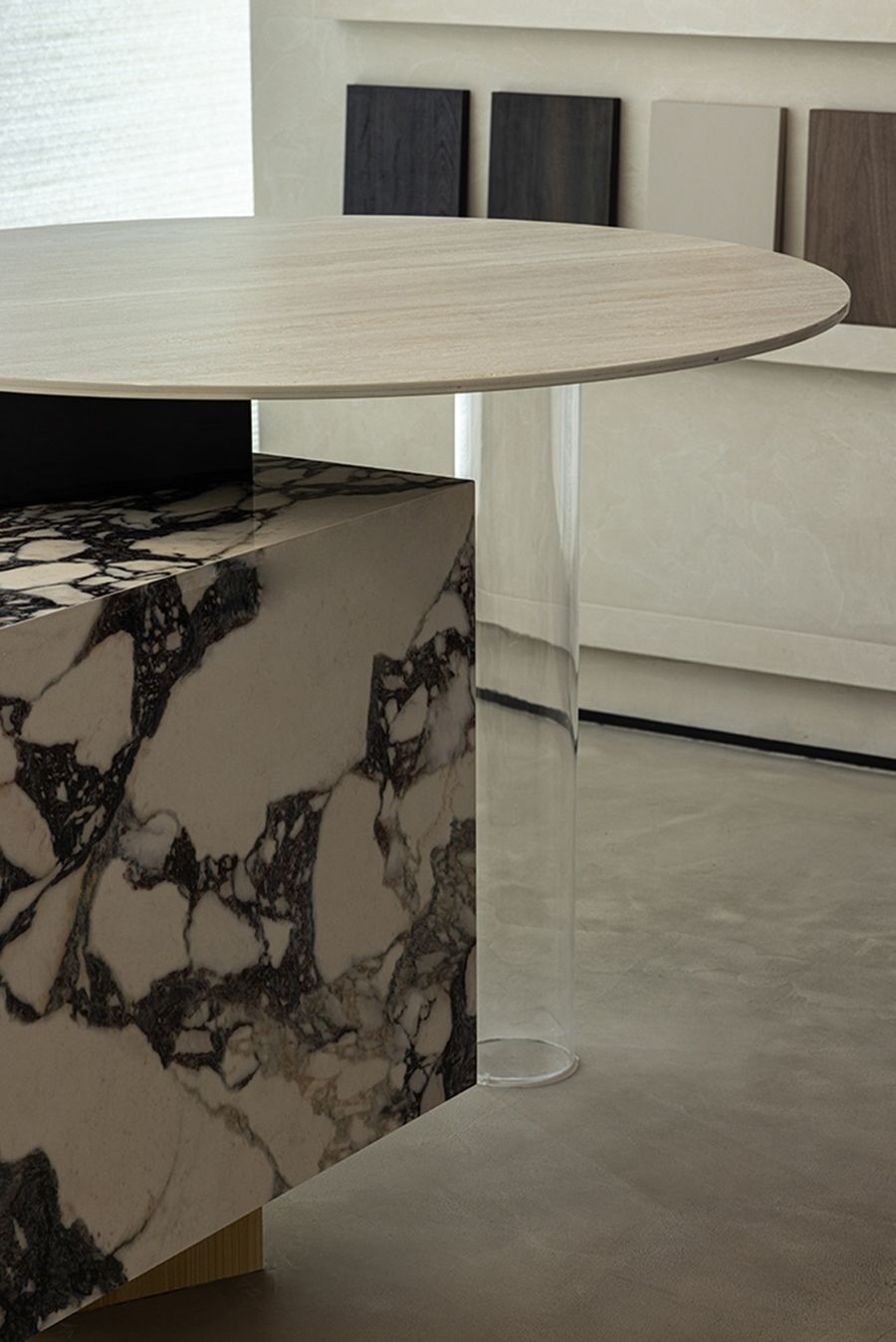
办公区简洁的几何线条演绎高级的美感,与造型独特的金属灯具装置相映成趣。Fragment不规则吊灯增添了趣味性与怪诞性。大理石工作台及穿插其中的木质吧台结合,材料的对立与碰撞,放大空间的反差感。而反差与矛盾,是令人着迷的。
The simple geometric lines in the office area deduce the high-end aesthetic feeling, which contrasts with the unique metal lamps and lanterns. The Fragment irregular chandelier adds playfulness and whimsy. The combination of the marble workbench and the wooden bar interspersed in it, the opposition and collision of materials amplify the sense of contrast in the space. The contrasts and contradictions are fascinating.
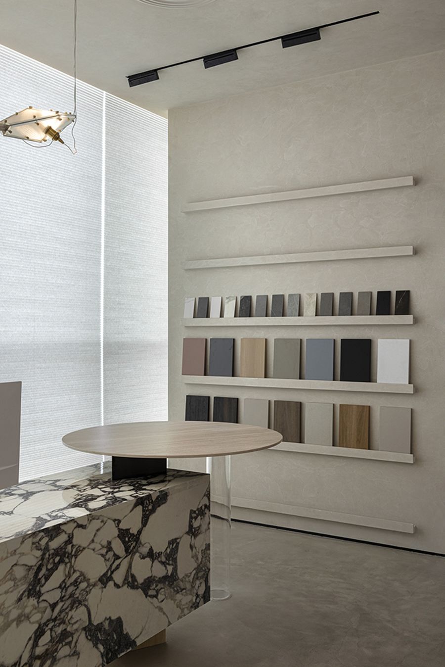
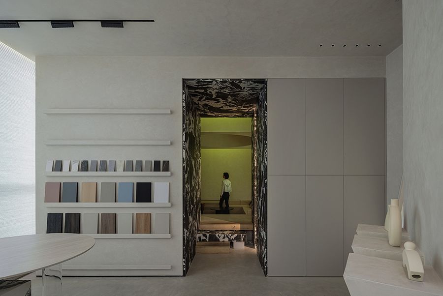
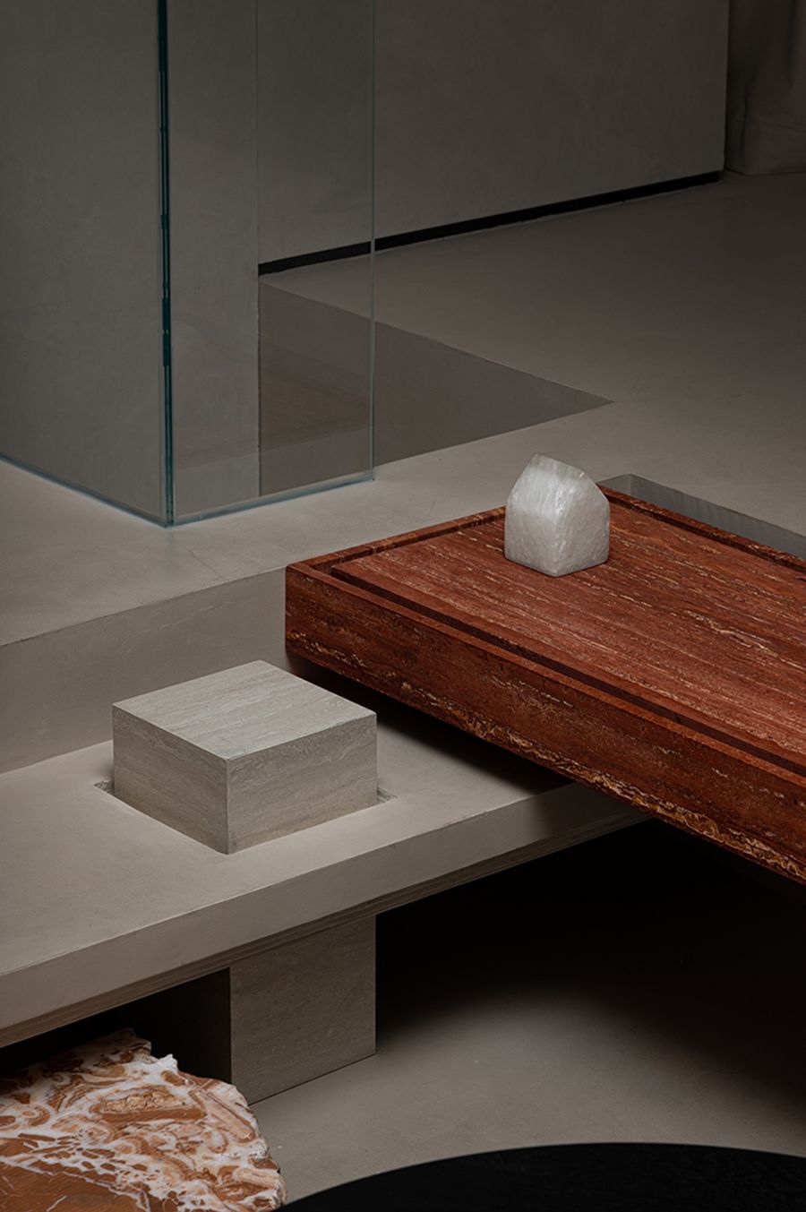
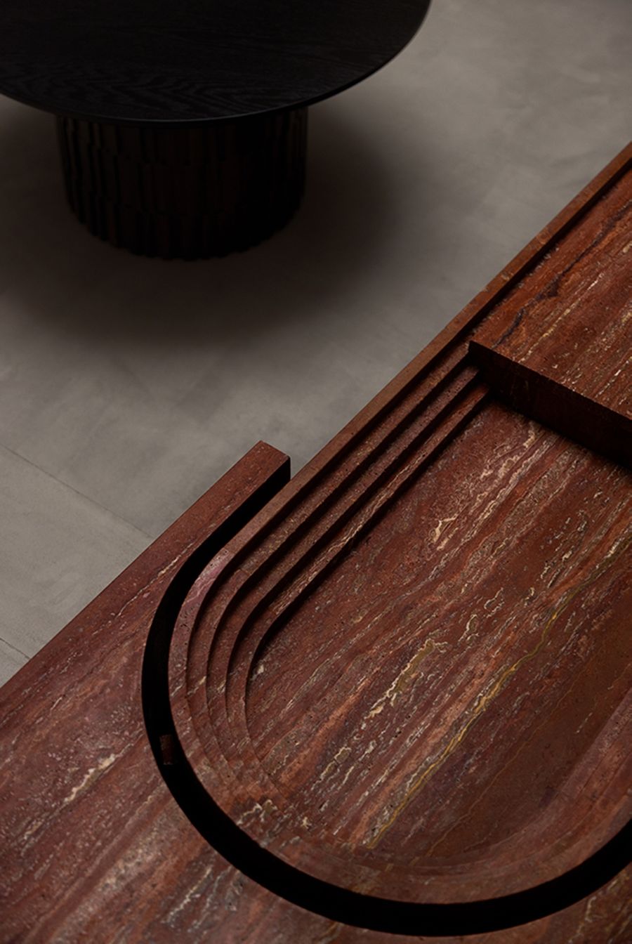
展厅不仅作为展示功能而存在,更是品牌与消费者沟通的场域。设计师结合日常观察,特别在办公室划分出一面选材区,呈现不同材质对于灯光设计的反馈,让参观者感受到品牌的细致,更好地助力展厅实现商业价值的转化。The exhibition hall not only exists as a display function, but also a place for brands to communicate with consumers.Based on daily observations, the designer specially divided a material selection area in the office to present the feedback of different materials on lighting design, so that visitors can feel the meticulousness of the brand and better help the exhibition hall realize the transformation of commercial value.
▲材料展示区,呈现不同材质对于灯光的反馈
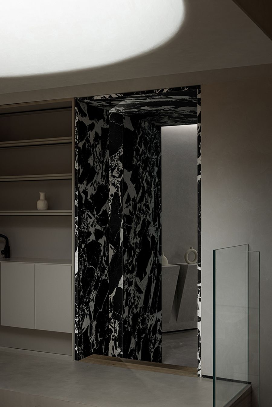
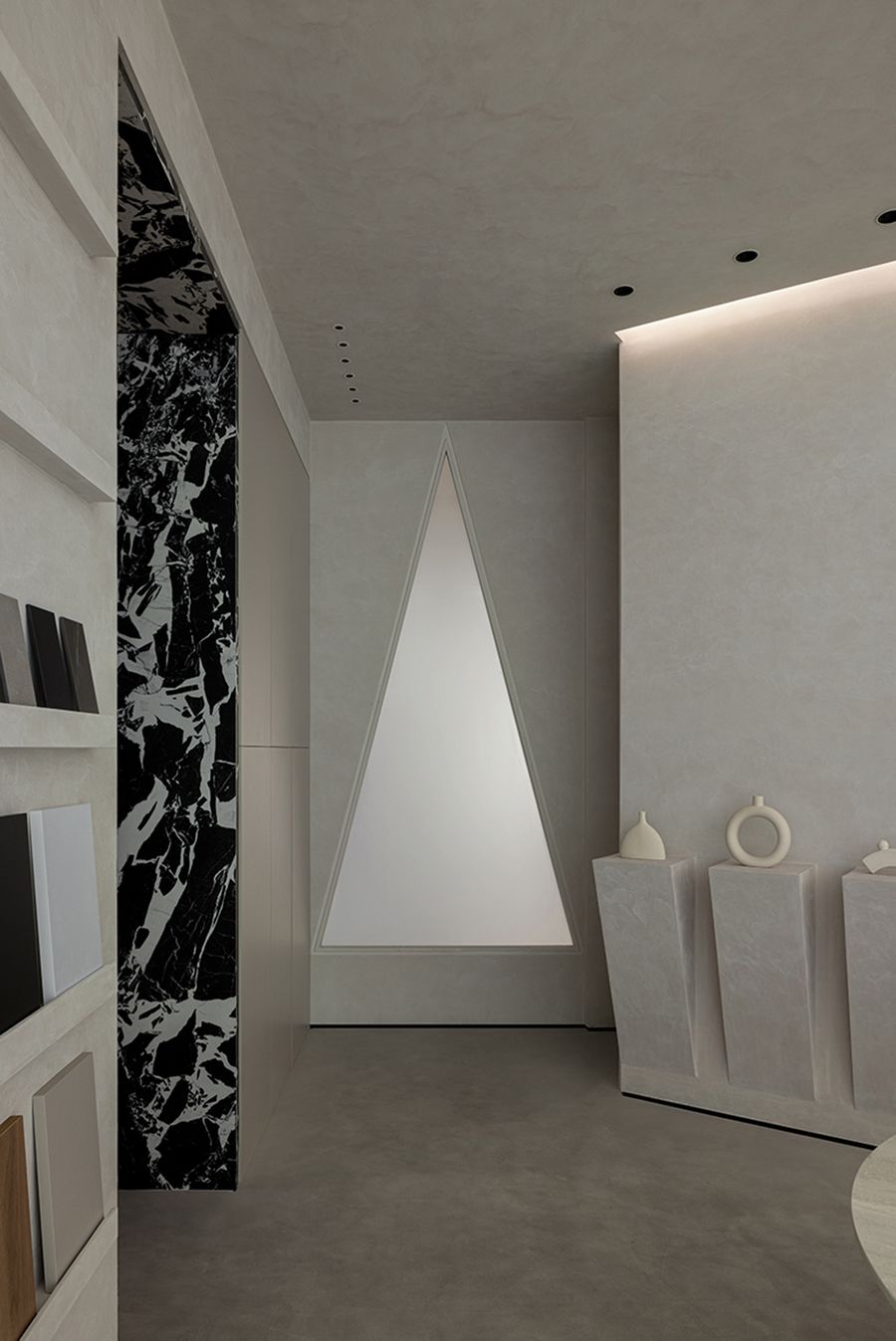
空间最中心的位置采用了黑色纹理的岩板,将过道的侧面和顶面融为一体,与整体氛围形成鲜明对比。设计特意增加了过道的深度,进一步强调了反差感。
The center of the space uses a black textured rock slab, which integrates the sides and top of the aisle, forming a sharp contrast with the overall atmosphere. The design deliberately increases the depth of the aisle, further emphasizing the sense of contrast.
Aria of Light
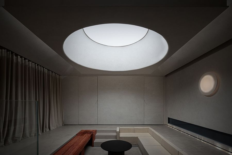
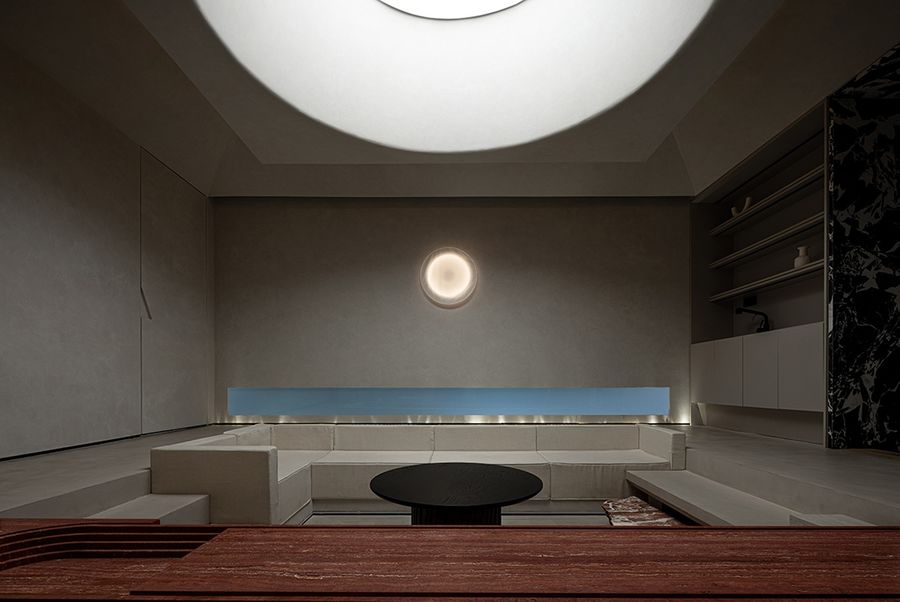
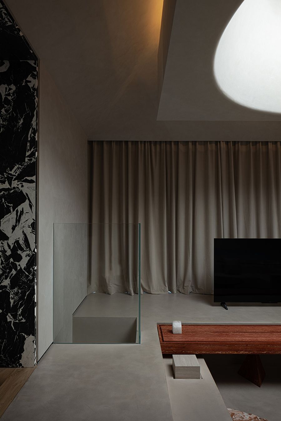
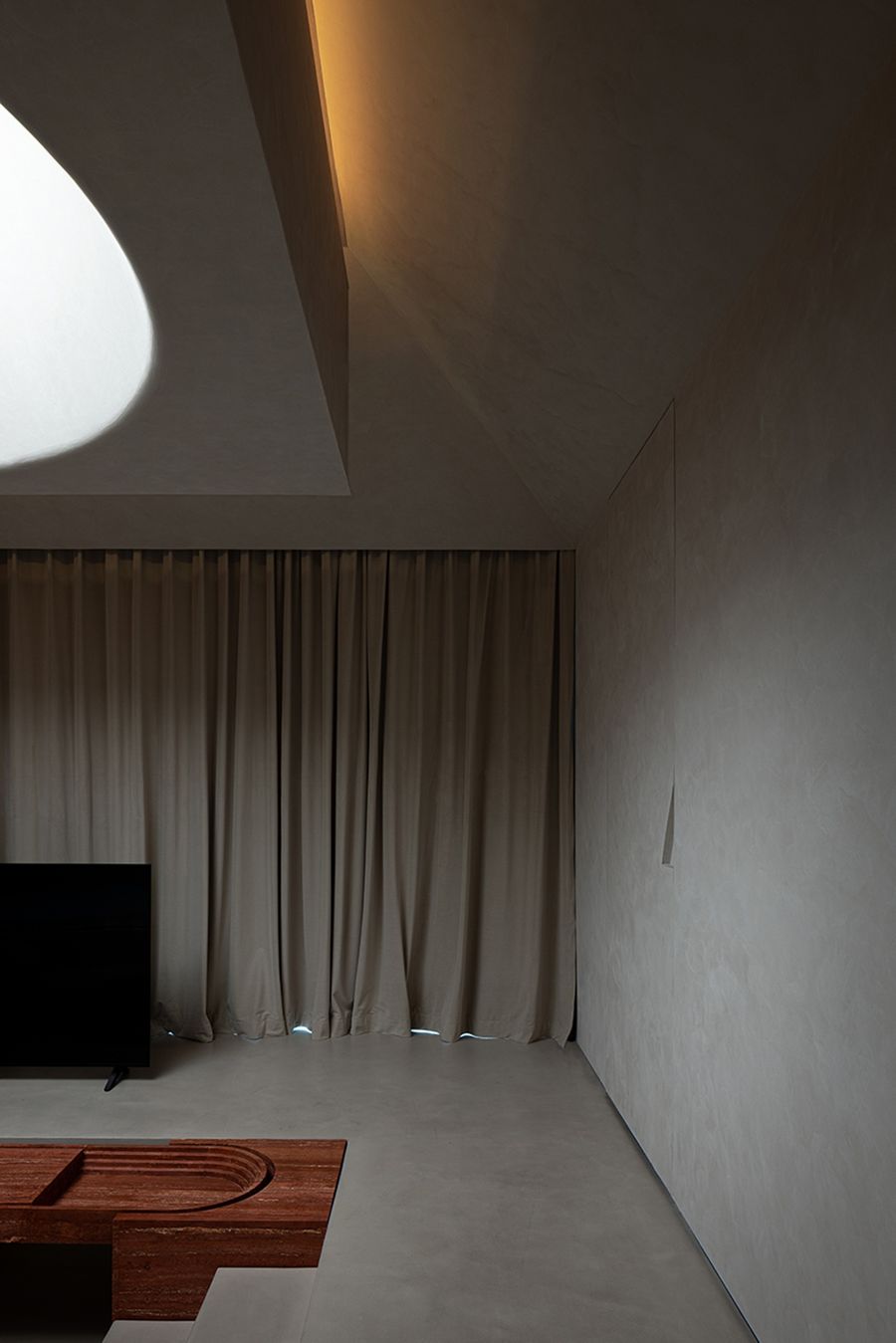
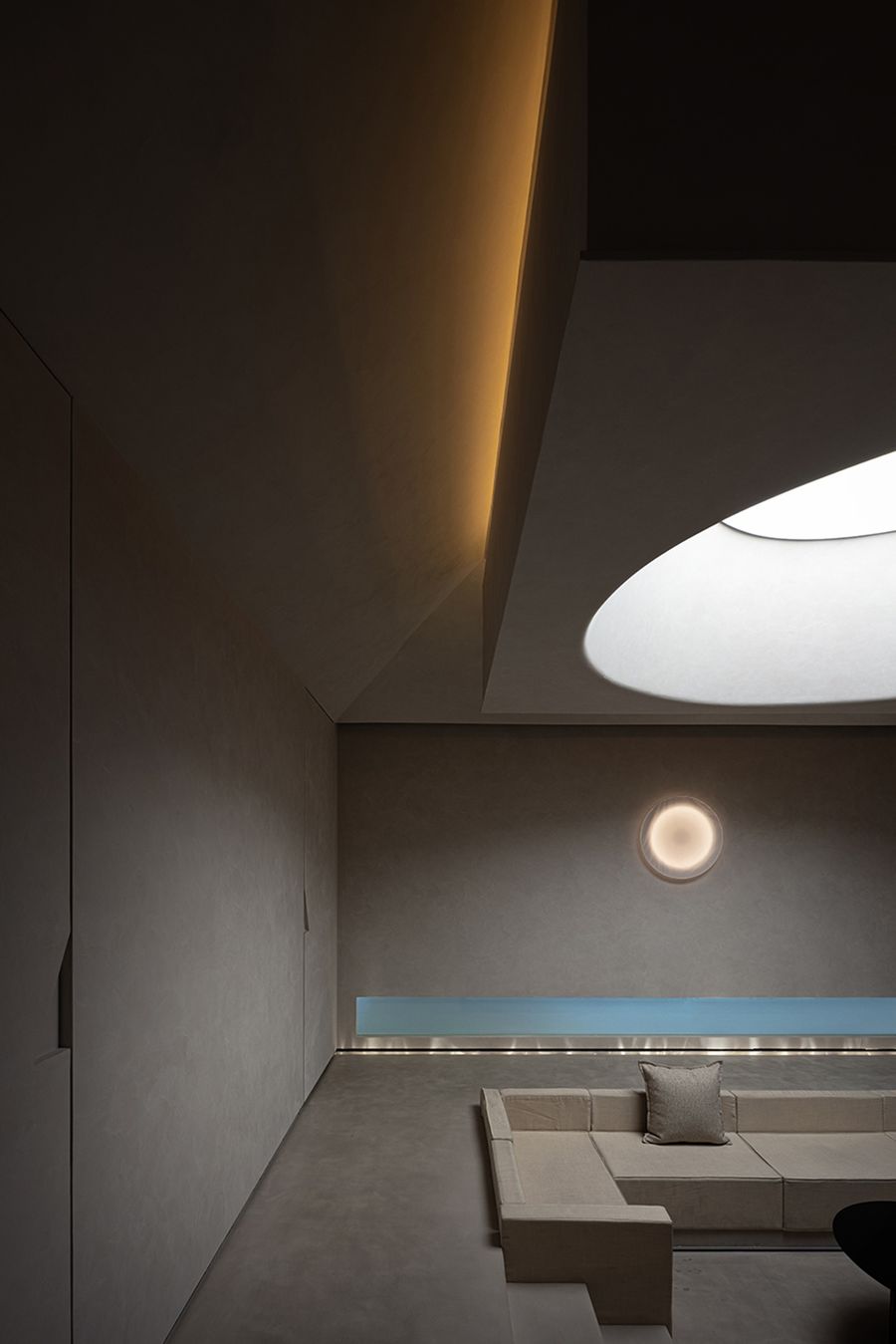
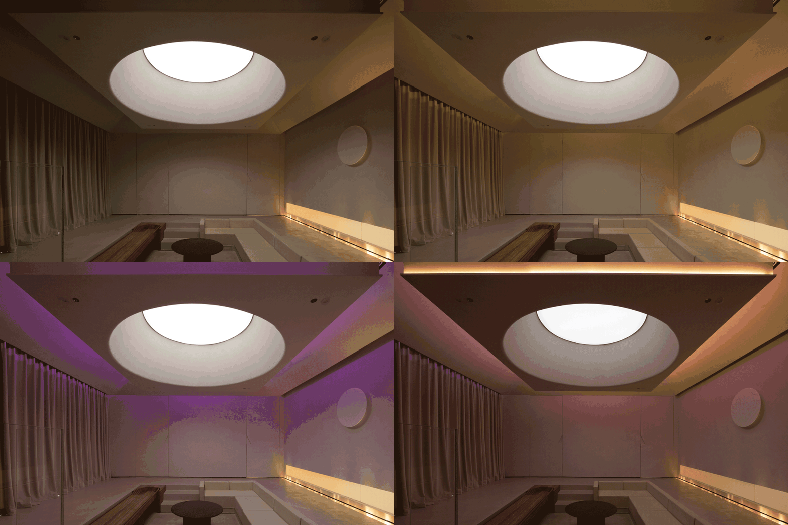
光的咏叹-客厅场景区将原有的空间打碎重造,采用中轴对称的空间布局,同时将天花进行挑空设计,模拟教堂天光井,构造穹顶造型,营造神圣的仪式感。
光膜通过造型层层叠叠的反射再投影到空间中,打造独特的光影效果,增强了空间神秘感。The living room scene area breaks up the original space and rebuilds it, adopting a centrally symmetrical space layout, and at the same time, the ceiling is designed to be hollowed out, simulating the church skylight well, and the dome shape is constructed to create a sacred sense of ceremony.The light film is projected into the space through the layered reflection of the shape, creating a unique light and shadow effect and enhancing the mystery of the space.
设计去掉繁冗堆砌,让纯粹的材质肌理去铺陈留白,光影明暗的交错,如同闯入了静谧梦幻的世界。将空间交给光,将时间交给光,将艺术交给光。
在这一方世界,光是唯一的主角。下沉式的落座区域营造围和感,将身体与心灵进行包裹,让游览者沉浸式体验光所带来的神秘与美好。The design removes the cumbersome piles and allows the pure material texture to lay out the blank space. The interlacing of light and shadow is like breaking into a quiet and dreamy world.Give space to light, time to light, and art to light.In this world, light is the only protagonist.The sunken seating area creates a sense of surrounding and wraps the body and mind, allowing visitors to experience the mystery and beauty brought by light immersively.
Geometry Game
几何游戏-每个功能区都有其别致的趣味场景,而几何元素,宛如戏剧的线索,贯穿于整个故事线当中,将不同的场景串联了起来。
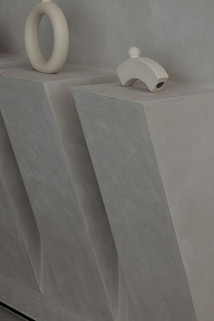
入口的几何组合元素已经为游览者埋下了故事的伏笔,随着深入空间的游览,从光影走廊尽头的大三角,到客厅场景区墙面隐藏的几何,稳定的三角形,端正的正方形,极具方向性的长方体,几何图形融于空间的每一处场景,等待着人们去挖掘。就像拼图一般,拿到一块碎片不知所云,将碎片收集组合,真正的主题才浮于水面,而每个场景也随之在游览者脑海中共同构成了完整的空间,增添了一份探索的趣味。Each functional area has its unique and interesting scenes, and the geometric elements, like the clues of the drama, run through the whole story line, connecting different scenes together.The geometric combination elements at the entrance have foreshadowed the story for the visitors. With the in-depth tour of the space, from the big triangle at the end of the light and shadow corridor to the hidden geometry on the wall of the scene area in the living room, stable triangles, upright squares, extremely Directional cuboids and geometric figures are integrated into every scene of the space, waiting for people to dig.Just like a jigsaw puzzle, when you get a piece of the puzzle and don’t know what to say, when you collect and combine the pieces, the real theme emerges, and each scene together forms a complete space in the mind of the visitor, adding an exploration fun.
▲材料展示区
▲材料展示区
▲材料展示区
▲场景体验区
▲场景体验区
Hidden Silence
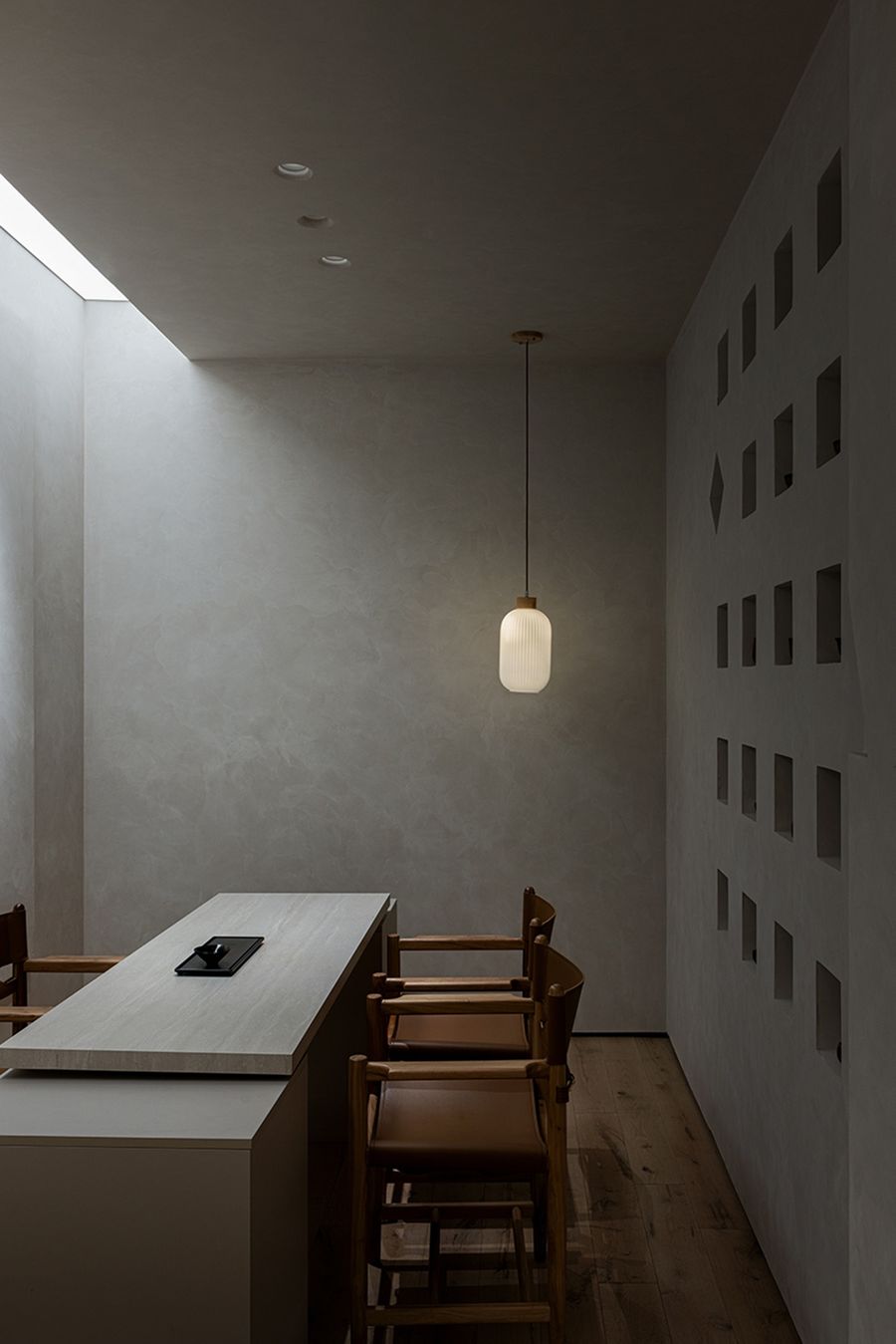
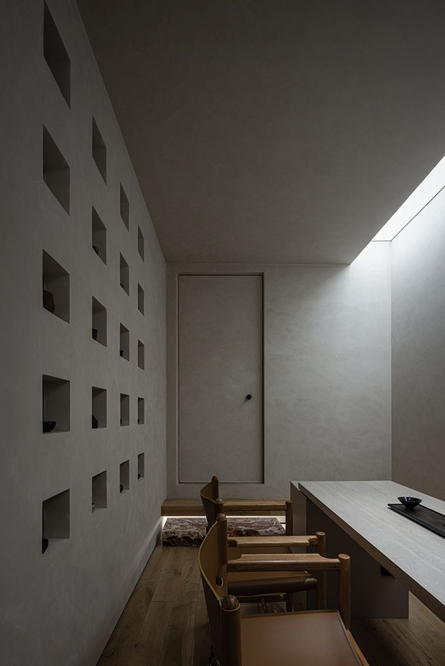
隐的静谧-茶室延续了空间轻灵纯粹的色调与质感,营造自然静谧的交流氛围。
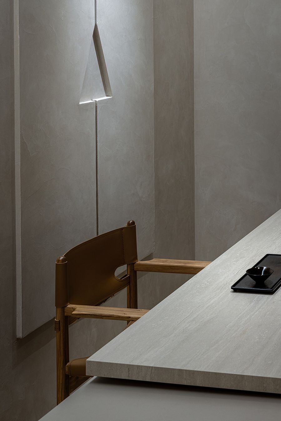
长方形的灯膜返射,将流淌的光线引入,投射诗意的语言。长方形与三角形组合的墙面造型,让空间更具秩序感。伴随着角落那一盏暖黄,浮躁的心也随之安静了下来。The tea room continues the light and pure color and texture of the space, creating a natural and quiet communication atmosphere.Rectangular light film reflectively introduces flowing light and projects poetic language. The wall shape combined with rectangle and triangle makes the space more orderly.Accompanied by the warm yellow lamp in the corner, the impetuous heart also calmed down.
以趣味的场景作为串联,通过制造反差感,搭建独特的空间体验,让游览者在场域当中体会到灯光设计所营造的美妙氛围。每一次的游览,都是与品牌之间的深度互动,这也是未知营造所想要传达的关于品牌空间设计的思考。
Using interesting scenes as a series, by creating a sense of contrast, a unique space experience is built, allowing visitors to experience the wonderful atmosphere created by the lighting design in the field. Every visit is an in-depth interaction with the brand, which is also the thinking about the brand space design that Undefined Builder Construction wants to convey.
.
..
-Name | 项目名称-光之剧场
-Project name | 项目地址-广州·天河区
-Spatial properties | 空间属性-商业空间·展厅设计
-Area | 项目面积-108㎡
-Project time | 项目时间-2022年









评论(0)