陶小象总部,坐落于佛山世纪滨江园区内。随着品致馆与全新VI的启动,此次全新的总部形象设计,实现了品牌飞跃的里程碑式进程,以崭新的面貌扬帆起航!
Tao Xiao Xiang headquarters, located in Foshan Park. With the launch of Pinzhi Pavilion and the new VI design, the headquarters has achieved a milestone process of brand leap and set sail with a new look!
通过设计,向参观者讲述品牌故事的同时,将其精湛的技术与工艺,以及陶瓷所蕴含的潜力展露出来。
Through the design, the brand's story is told to visitors while revealing its exquisite technology and craftsmanship, as well as the potential influence contained in the ceramics.
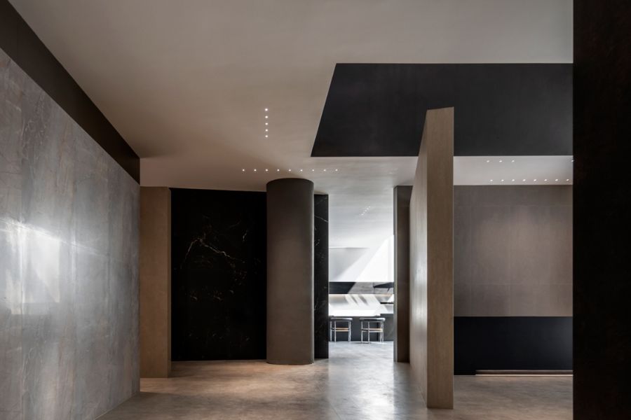
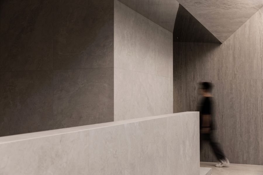
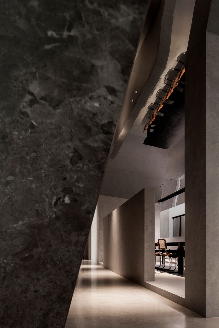
设计运用环绕式动线,采用多种展示方式,创造出丰富的产品场景。
The design uses a wrap-around dynamic line and a variety of display methods to create a special scene for showing the products.
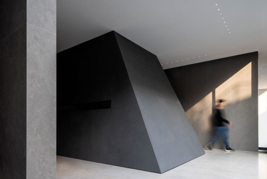
以块体间组合构建让不同品类产品交替组合,消除来者参观时可能产生的疲劳感。通过合理地搭配,让多款产品在空间中也不会互相“打扰”。
The combination of blocks allows different types of products to be combined alternately, eliminating the fatigue that may arise when visitors visit. Through reasonable matching, multiple products in the space will not "disturb" each other.
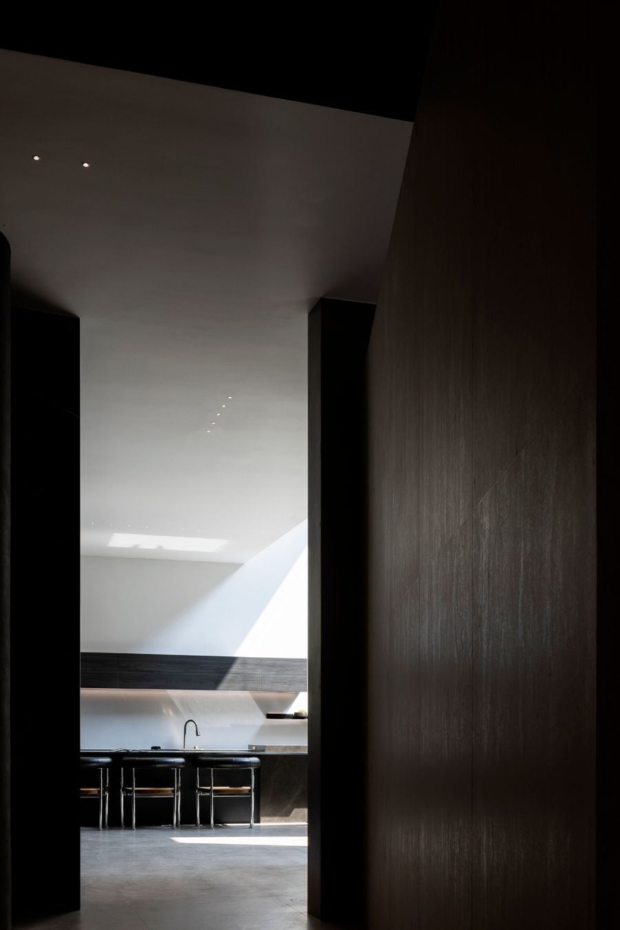
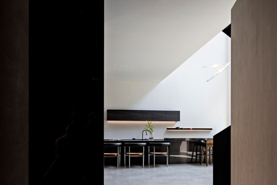
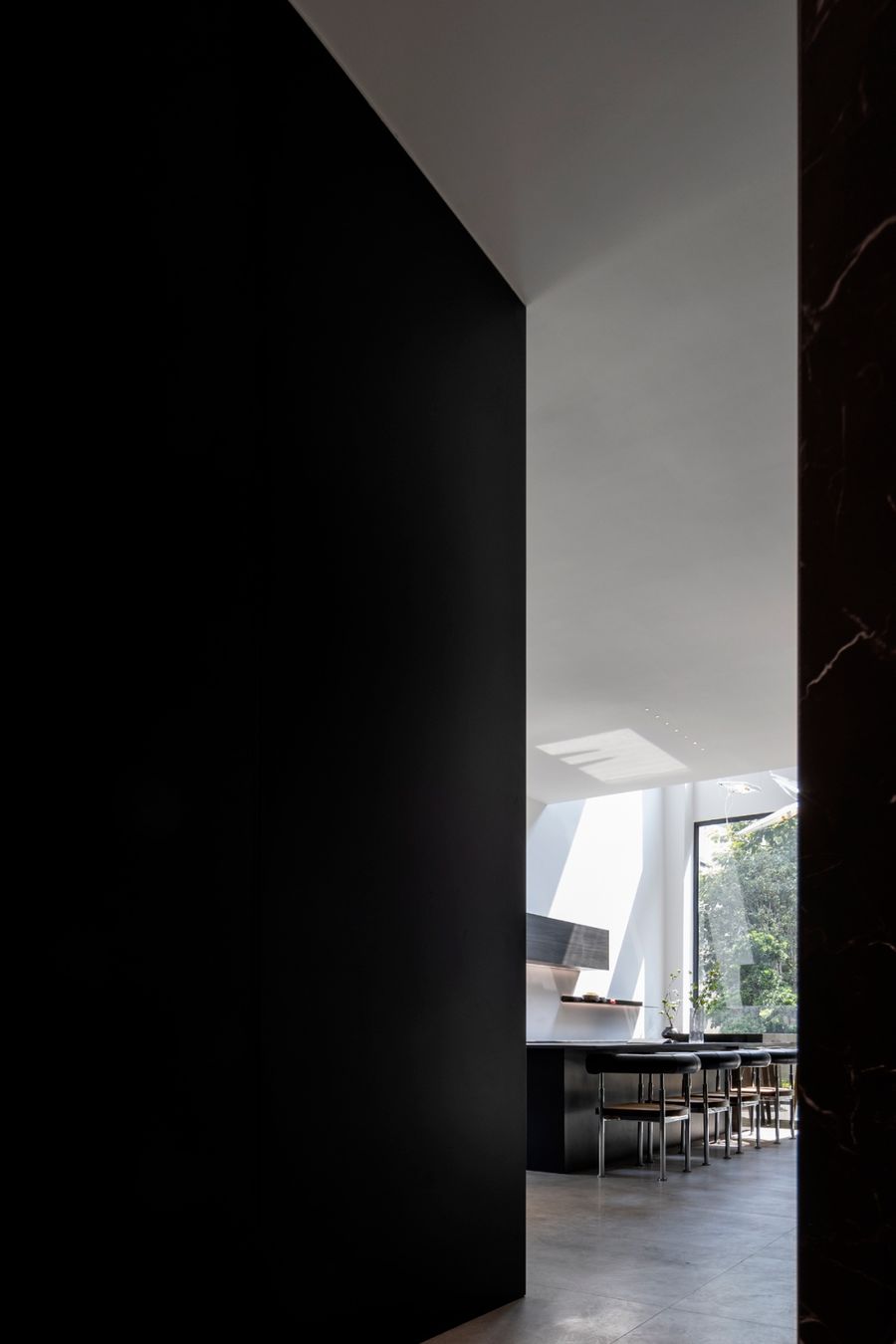
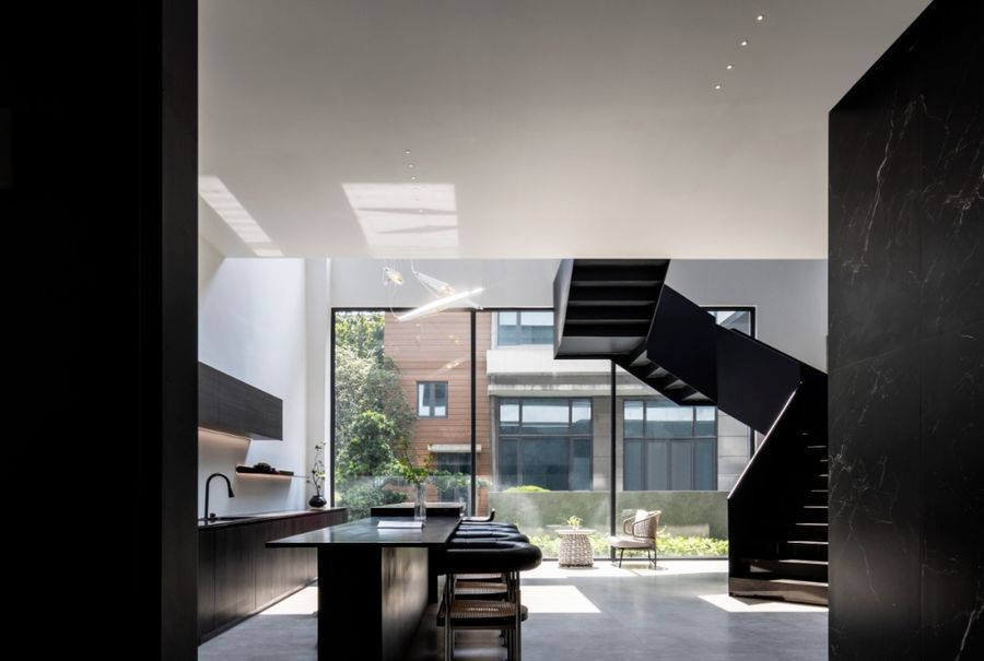
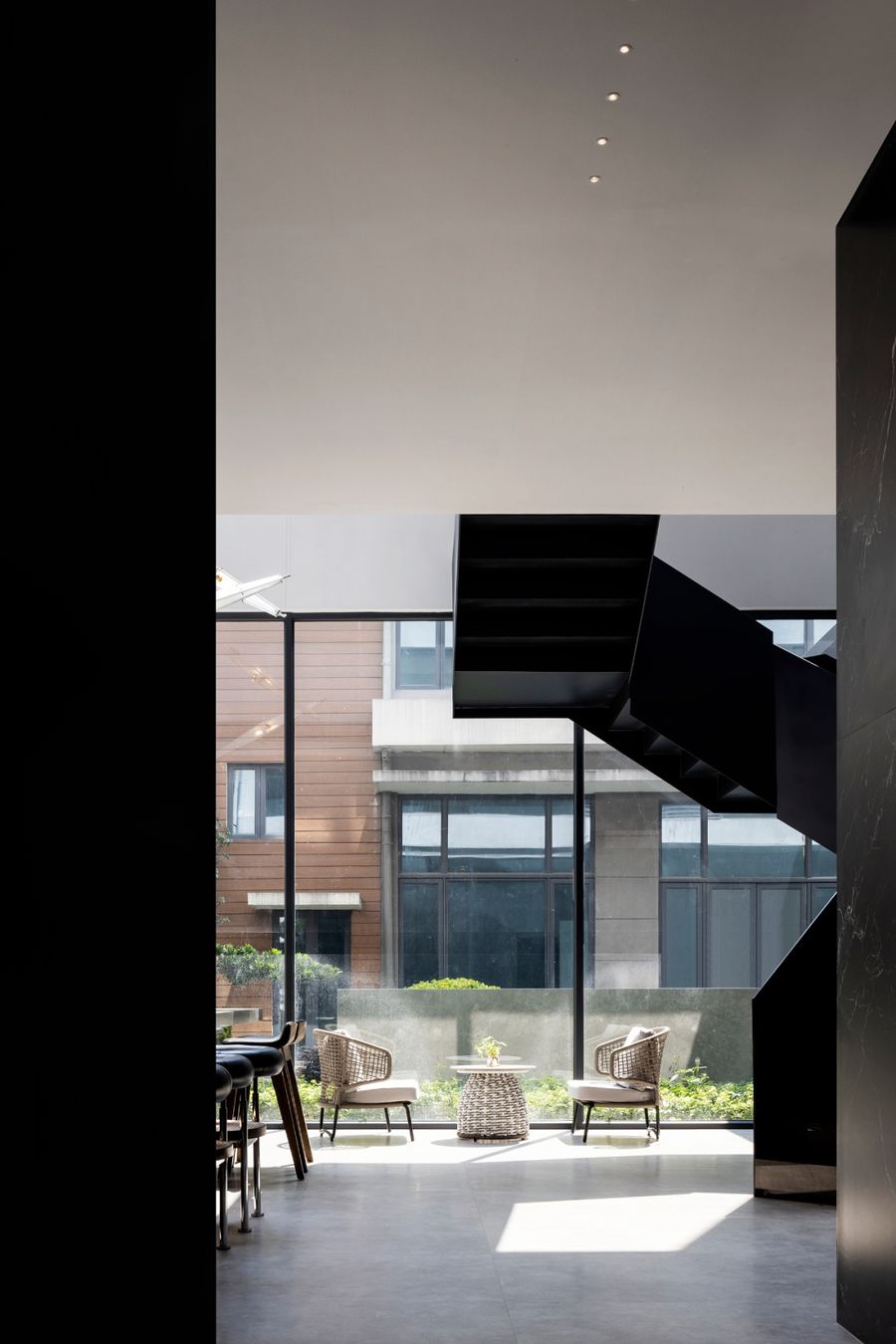
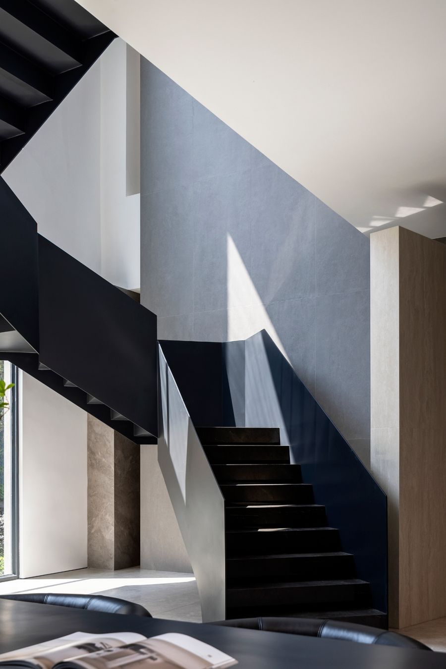
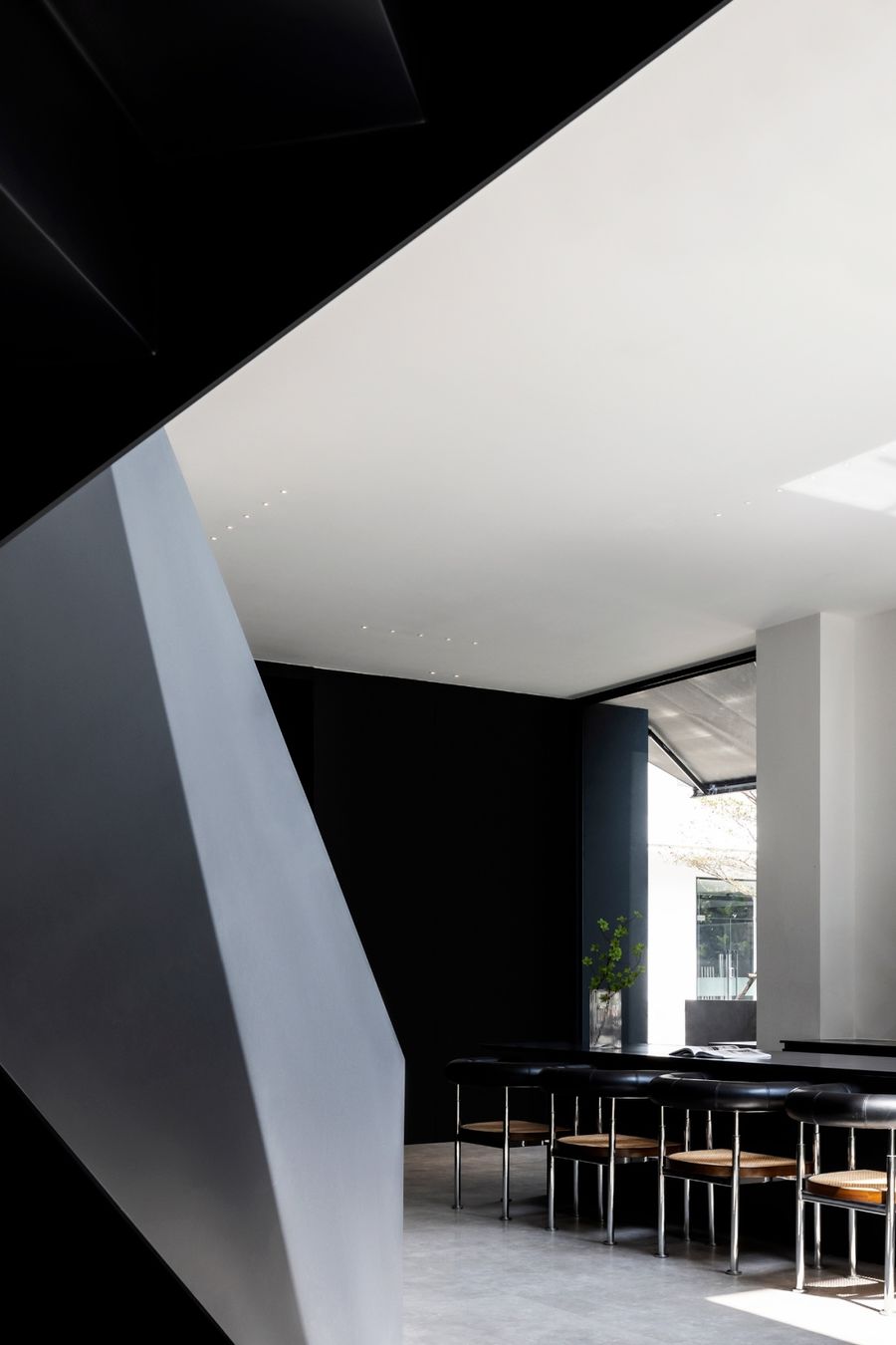
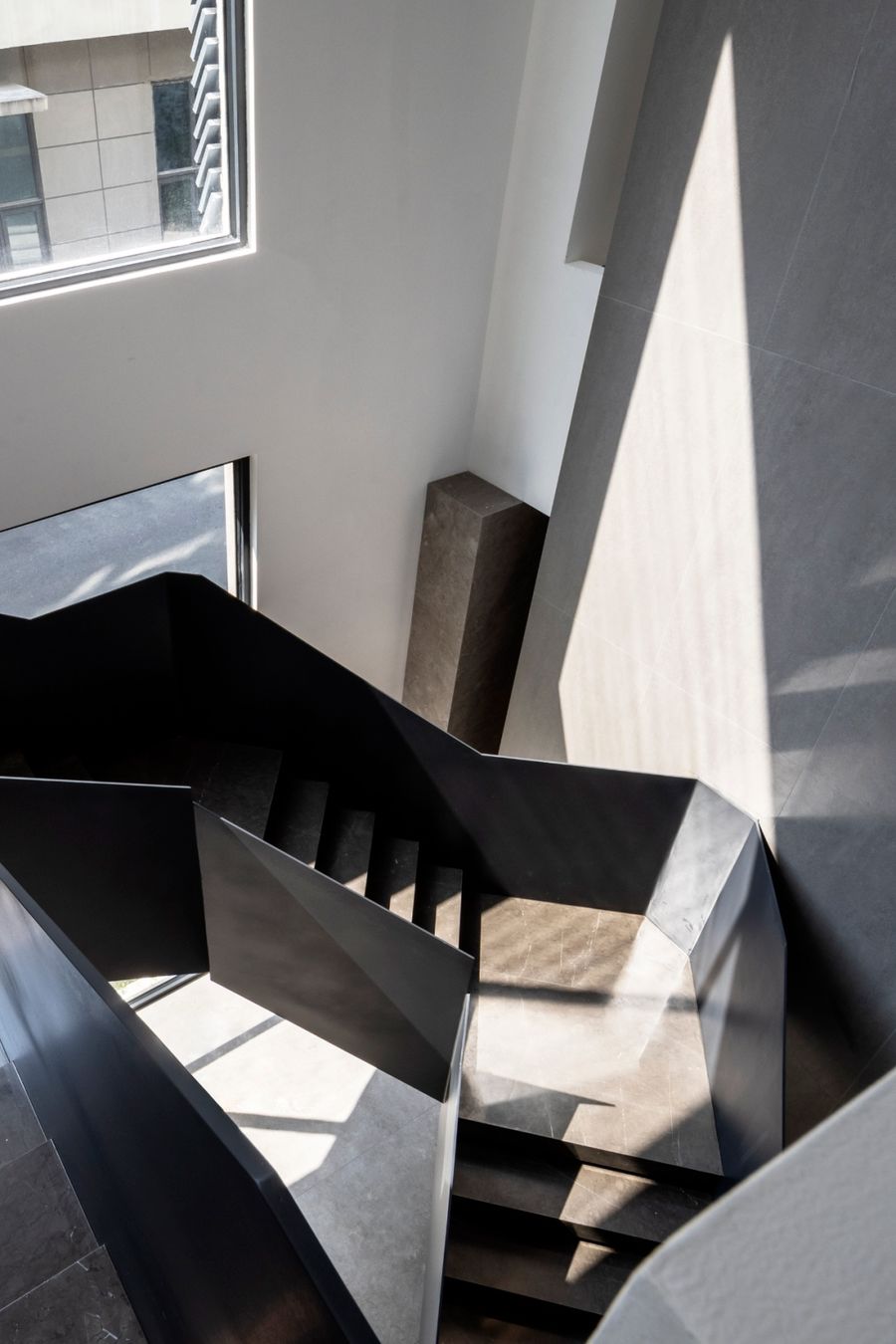
水吧区作为人们聚集的中心,而旋转楼梯作为人们流动的主通道,这里有着充足的空间,满足员工的需求和全方位应用,大家在这里能轻松自由地交谈、停留。
The water bar area serves as the center for people to gather, and the revolving staircase serves as the main channel for people to flow, where there is sufficient space to meet the needs of employees and all-round applications, and where people can talk and stay easily and freely.
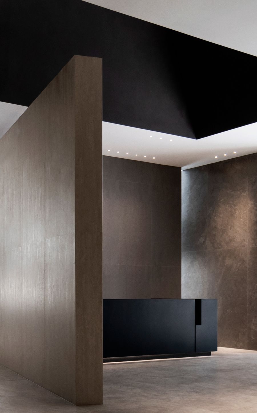
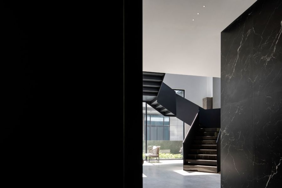
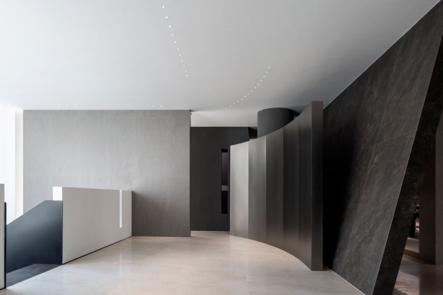
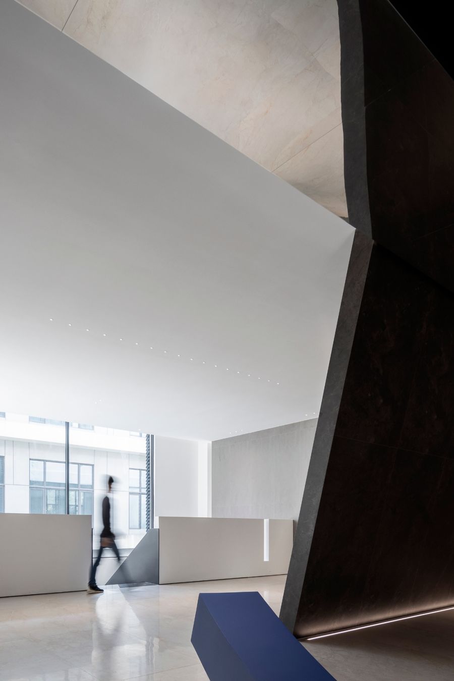
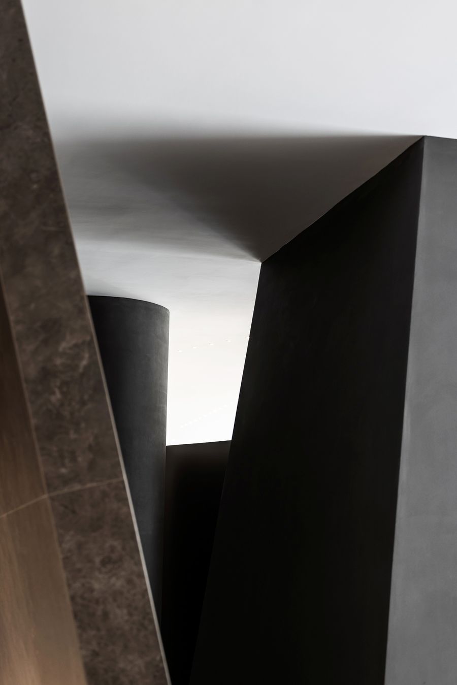
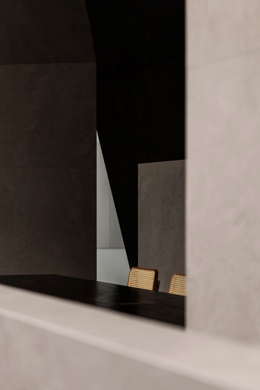
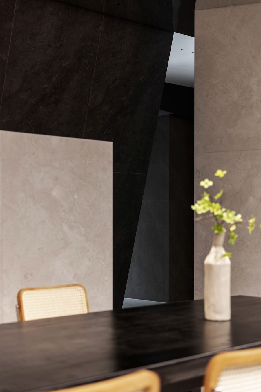
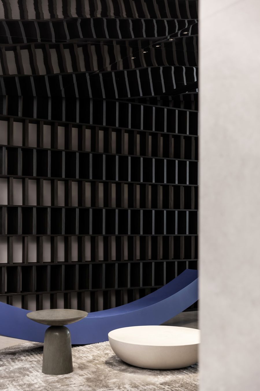
通过旋转楼梯上去,就来到二层展示区域,设计延续陶小象的产品风格,以黑白灰为主色调,在复杂与简单之中找寻美感的平衡,让空间简约大气而充满质感。
Through the revolving staircase up, you will come to the second floor display area. The design continues the style of Tao Xiaoxiang's products, with black and white gray as the main color, finding the balance of beauty in complexity and simplicity, making the space simple and atmospheric and full of texture.
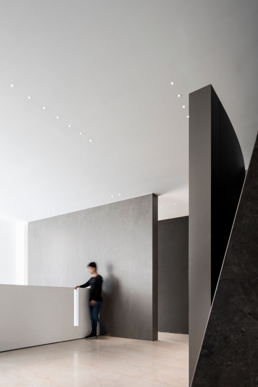
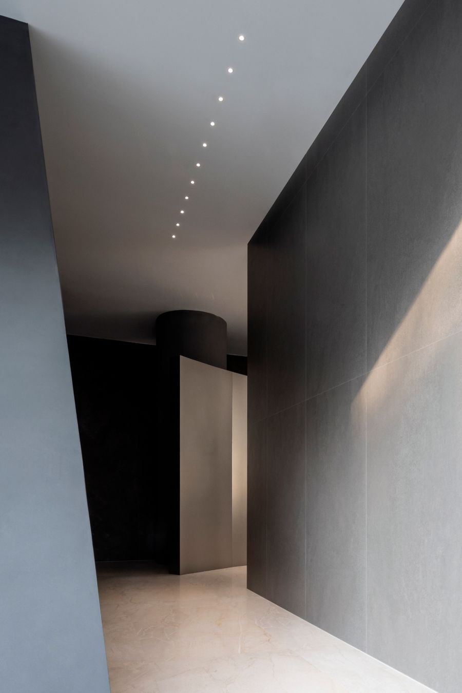
通过严谨的设计手法与精心的产品选择造就出纯粹的空间,没有多余的元素,使人们的注意力全部聚焦于产品选购以及全新的空间上,感受品牌形象和产品前所未有的新气象。
Through a rigorous design approach and careful product selection to create a pure space, no superfluous elements, so that people's attention is focused on the product selection and the new space, feel the brand image and product new look like never before.
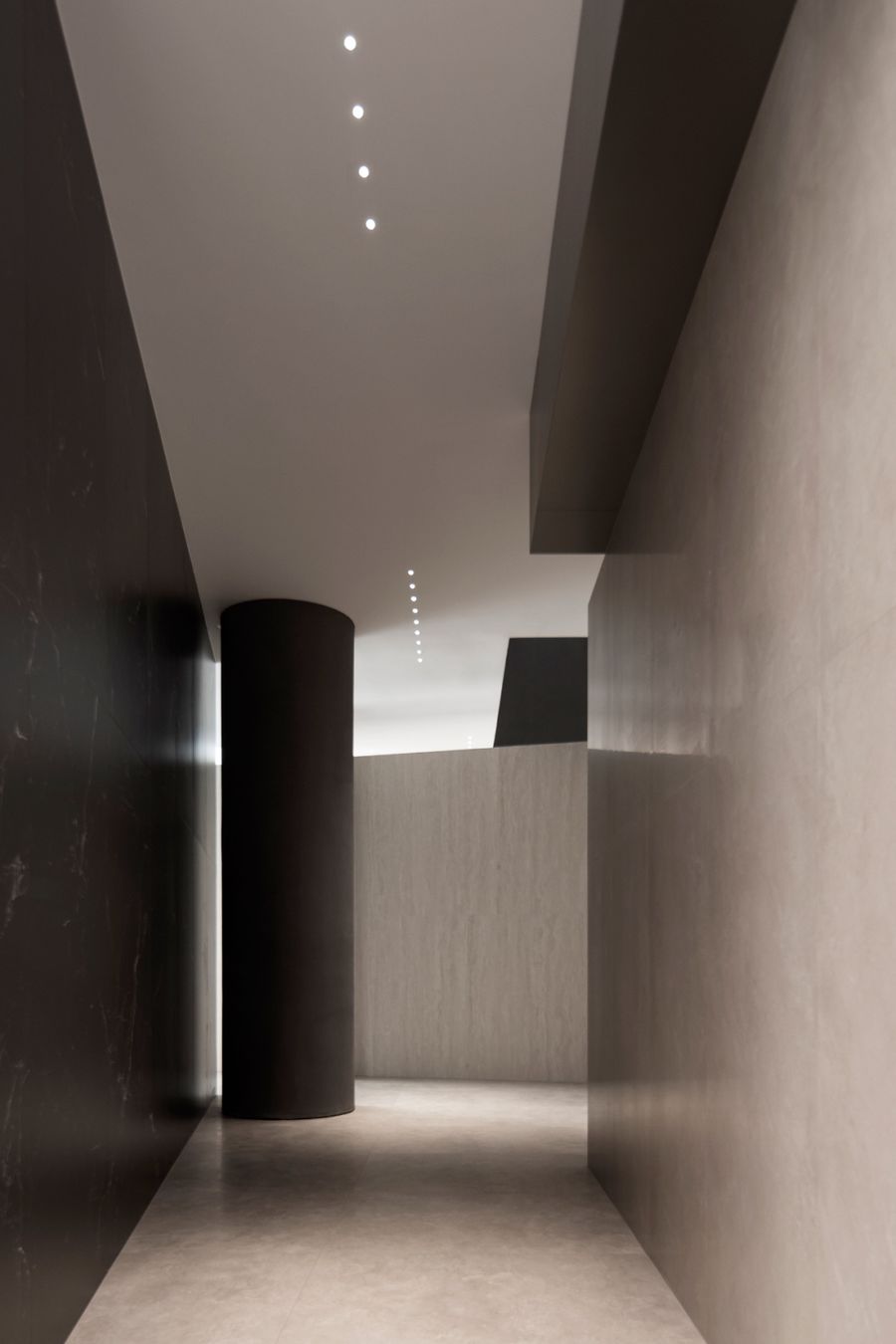
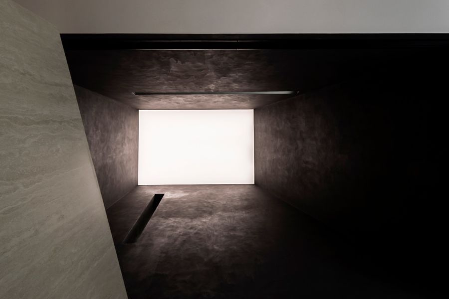
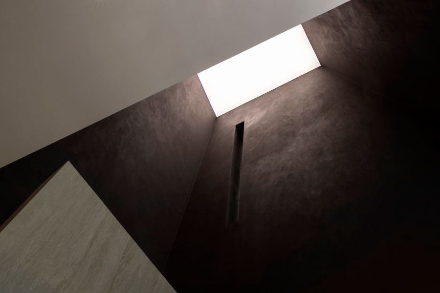
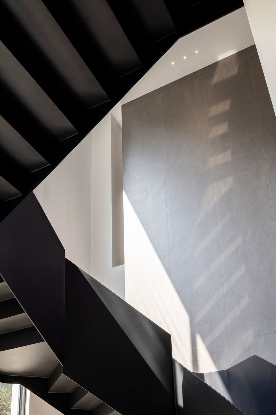
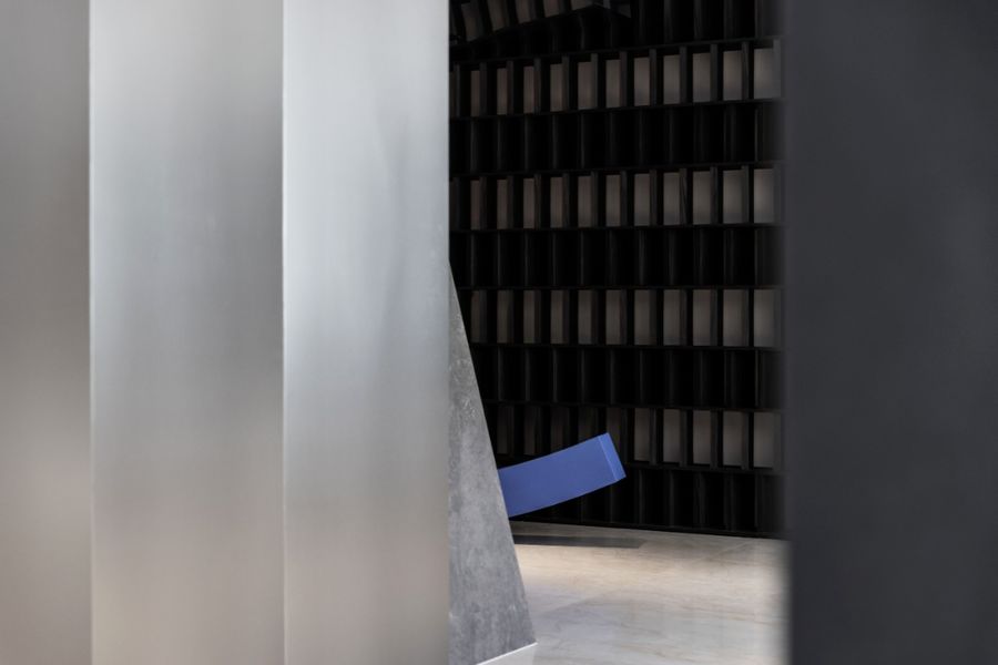
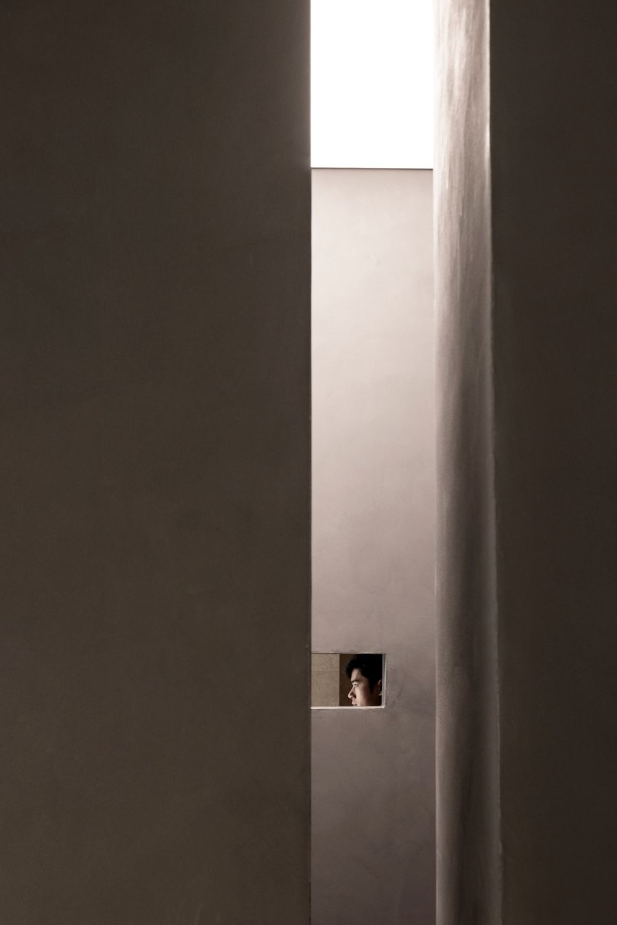
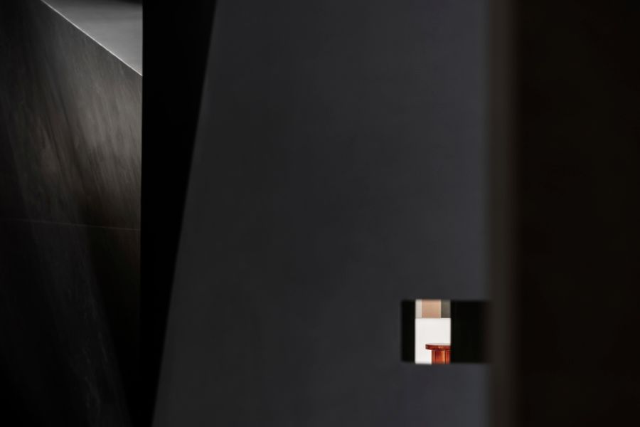
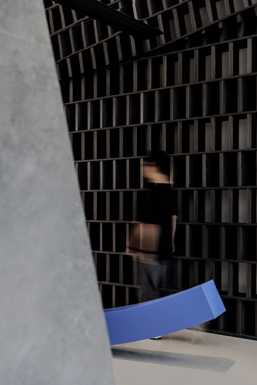
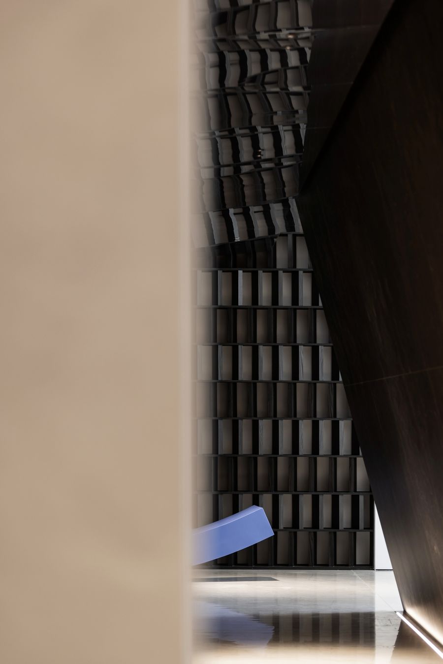
随着参观者的位置和光线角度的变化,感觉就像一个人穿梭在都市中,让人产生强烈的好奇与探索的欲望,有一种缥缈流动的感官体验。
As the visitors walking through the hall, changing positions will also changing the light angles, it feels like a person traveling through the city, creating a strong desire for curiosity and exploration and an ethereal flowing sensory experience.
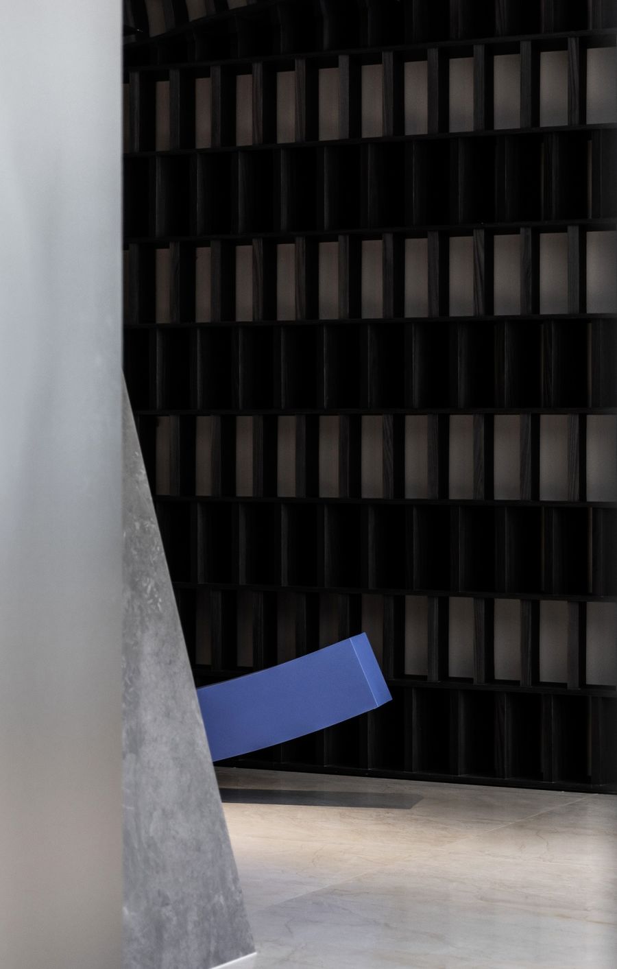
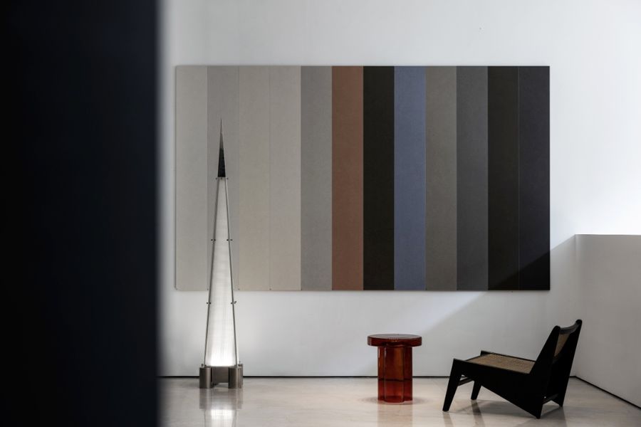
对于建筑美感和空间功能的理解,以不同的材质述说着不同的故事。
The understanding of architectural beauty and spatial function tells a different story with different materials.
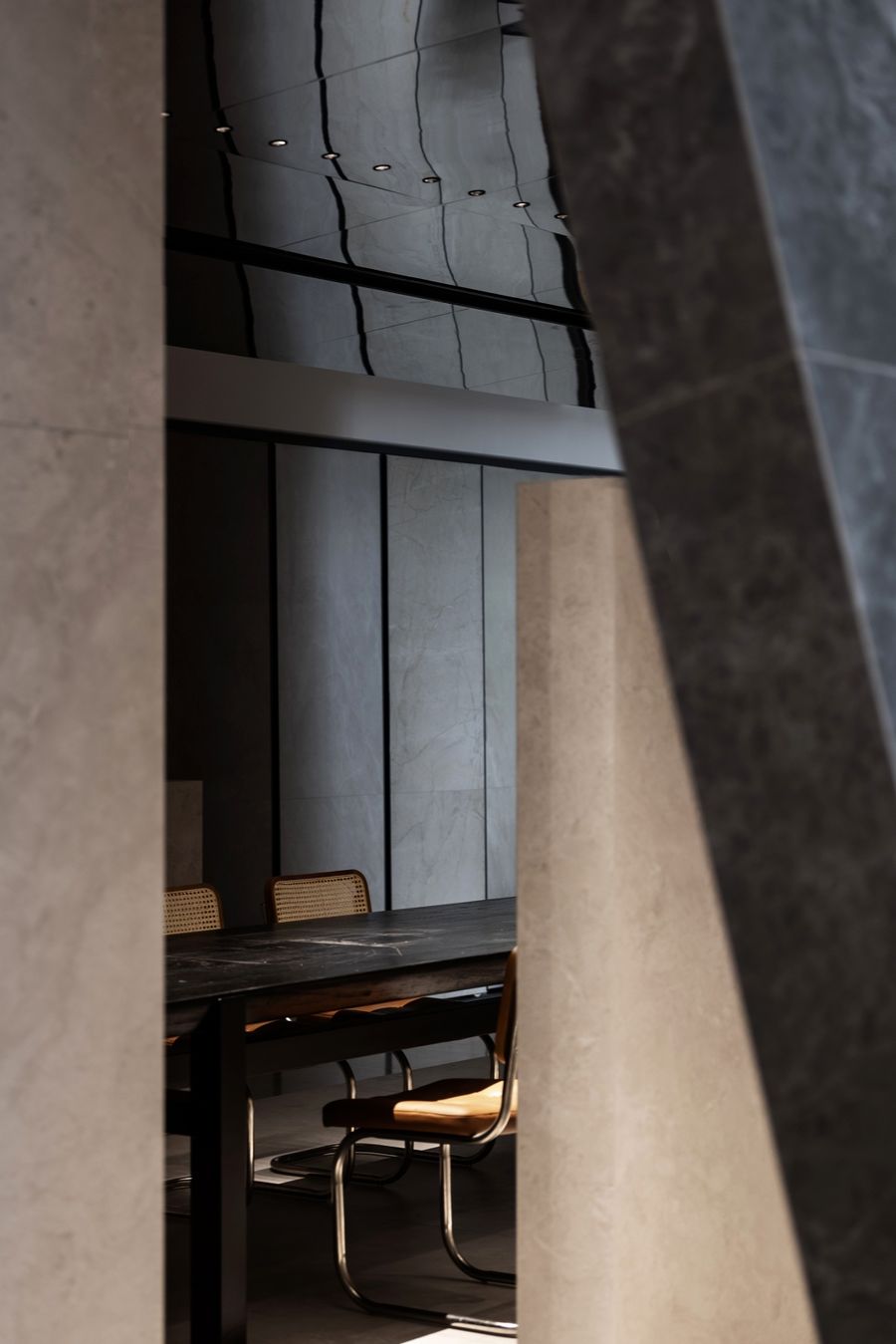
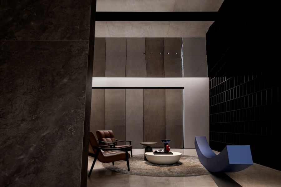
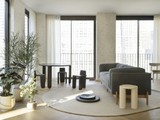
洽谈区细腻的肌理与典雅的色彩,营造出层次丰富且轻松舒适的氛围,更为深层次的合作交流提供了充足的场所。The negotiation area, with delicate texture and elegant colors, creates a rich and relaxing atmosphere, and provides sufficient space for deeper cooperation and communication.
项目信息Information━
项目名称:陶小象总部
Project Name: Tao XiaoXiang headquarters
设计范围:商业展厅设计
Design Category: Commercial exhibition hall design
项目地点:广东佛山
Project Location: Foshan, Guangdong, China
项目面积:600㎡
Project Area: 600㎡
设计机构:马思设计
Design Company:MAX Design
主持设计师:谢法新
Design Director:Martin Tse
灯光顾问:光合作用照明设计, 杨庆书(茂域照明)
Lighting Consultant: Photosynthesis Lighting Design, Yang Qingshu (MERCANVEE)
摄影师:冯建-Jam
Photography:Jam
更多相关内容推荐







评论(0)