每一刻即当下
Every moment is the present
中古
Vintage
我一直认为,中古的状态,就似一场久别重逢的偶遇。
I always believe that vintage is a status, just like the reunite after a long separation.
是时光荏苒后,那种安静而内敛的沉淀之美。褪去的是那股生人勿近的高傲姿态,剩下的则是岁月浸染的轻柔与平和。而这种美好的状态,也并非适应于所有人。所以,当下即是当下,犹如静止的时光,安静且从容。
It is the precipitated beauty of quiet and reserved after time flies. What fades away is the arrogant attitude of keeping strangers away, while what remains is the softness and peace of the years. However, this wonderful status is not suitable for anyone. So the present is the present, as a still time, quiet and calm.
个性化商业
Personalized Commercial
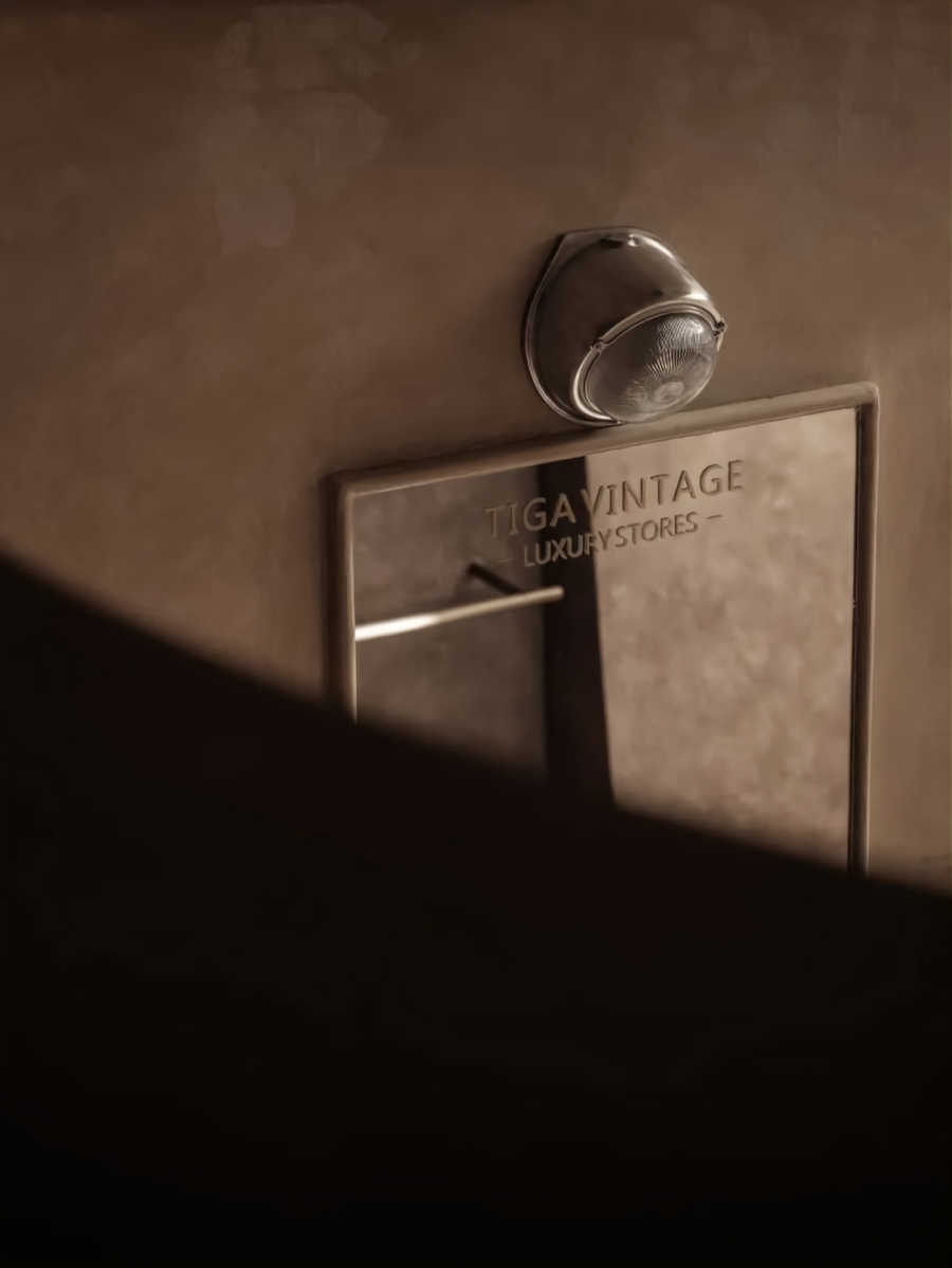
迪佳,是一家没有成熟商业基因,也没有完整团队架构的个性化商店。并且,她们也并不期望一定要达到某种所谓成熟的状态。她们甚至没有一套完整的VI系统。
Dijia is a personalized store without a mature commercial gene or complete team framework. Besides, they do not expect to reach a mature state. They do not even have a complete VI system.
如果说迪佳究竟是一家怎样的商店。我可能会认为,这更像是属于迪、佳两姐妹的生活道场,是她们诠释中古与生活方式的一种态度。安静的,旧旧的,没有距离感的一家特立独行的小店。而它所呈现出来的印迹,则预示着它允许其自然生长的生命特性。
To explain what kind of store is Dijia. I might think it’s more like the livelihood owned by the sisters of Di and Jia, it is their attitude to interpret the vintage and the way of life. Quiet, old, a maverick shop with no sense of distance. While the imprint it presents indicates the life characteristics that allow its natural growth.
建筑基础
Architecture Foundation
两百多平米的建筑面积,作为一家中古商店而言,并不算紧凑。加之较高的建筑层高关系,甚至可以算得上空间富裕。但因其C字型的建筑结构,以及居中的两根大立柱而产生的空间限制,让原本宽敞的物理空间,显得犹如被拆分开来的独立小方块。如果设计按照现有的建筑结构设定而展开,势必会大大减弱空间的体验感。
The floor area is more than 200m², as a vintage store is not compact. Combined with the high building height, it can even be regarded as space-rich. However, since the “C” shape building structure and the space limitation caused by the two large columns in the center, make the originally spacious physical space appear as if it were separated into independent small squares. If the design is developed according to the existing building structure settings, the experience of space would be significantly reduced.
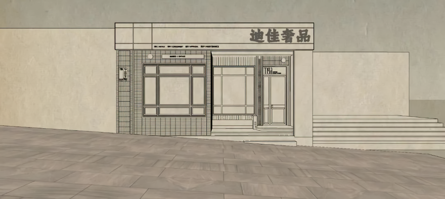
同时,作为一家临街商铺,受限于山城独特的地形特征。原建筑空间关系与室外坡道形成了两种截然不同的空间关系。面向门头的右边建筑明显高于街道,而左边建筑则远远低于街道的完成面。这不仅影响了室内外的空间关系和行动路线,也会因为高低落差关系,埋下雨水倒灌进室内的安全隐患。
As well, as a street shop, limited by the unique topographical features of mountain cities. The original building space relationship and outdoor ramp form two completely different spatial relationships. The building on the right facing the door head is higher than the street, while the left side is far below the finished surface of the street. This not only affects the indoor and outdoor spatial relationship and action route, but also the potential safety hazard that rainwater is poured into the room due to the height difference.
设计探索
Design Exploration
综上所述,我们不仅仅是要搭建一个可供销售产品的商店。而是在保证基本诉求的前提下。更需要满足的是个性化的商业表达,这将与主理人的状态密切相关,但也不仅仅只是对她个人喜好的表达,同时还需满足她们在真实使用状态下的考虑。那种属于重庆女人独有的洒脱和自由的状态,当然,我认为,这也是一种骨子里所散发出来的自信感。我希望这样的空间,应该是可以翘着二郎腿,叼着香烟跟您一起探讨产品价值观的舒适感。
Overall, we not only need to build a store for selling productions, but also a space on the premise of ensuring basic demands, it takes more to satisfy the personalized commercial expressions, these would be closely related to the state of the manager, but not just an expression of her personal preference, at the same time, it is necessary to satisfy their consideration in real use. That kind of free and easy state especially belongs to Chongqing women. Of course, I think it is the confidence gives off from the deeper inside. I hope the space would be like that can cross legs and hold cigarettes to discuss the comfort of product values with you.
而设计手法的表达,则融入了对于重庆这座城市的深刻理解。起伏错落的地理面貌、浓重的油彩韵味、以及极度包容的城市人文。都将以我们所理解的方式融入在这一空间之中,所以,单一的风格表达将不再成立,取而代之的是一种融合的空间感知状态。
Furthermore, the expression of design technique is integrated with a deep understanding of Chongqing. The undulating geography, strong paint charm, and the extremely inclusive urban humanities. Would be integrated into this space in a way that we understand, so the single style expression will no longer be established, instead, it will be a state of integrated spatial perception.
空间描述
Spacial Description
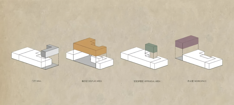
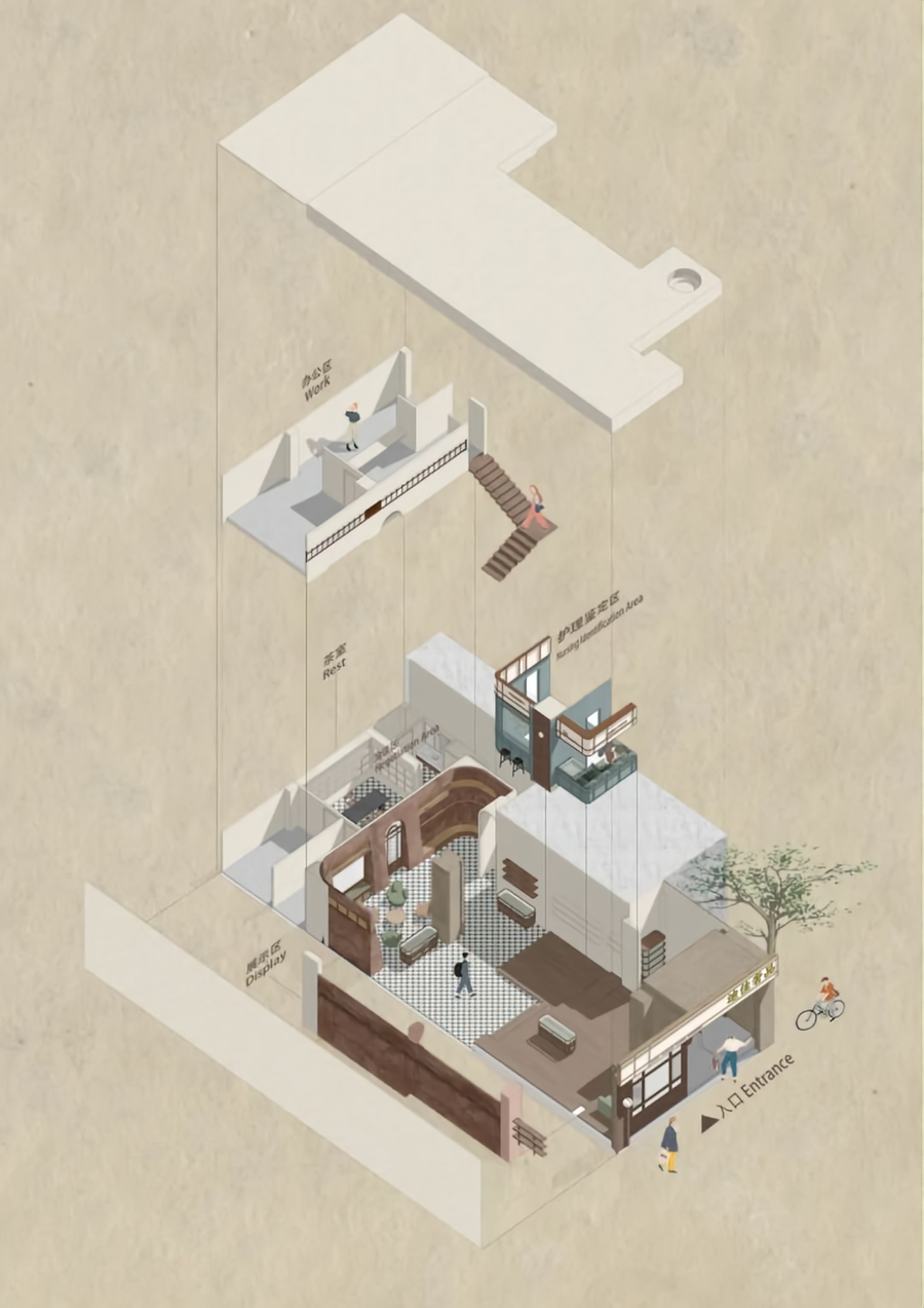
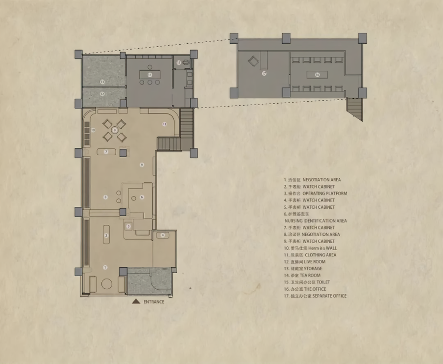
于是,我们将空间根据实际需求,拆分为了五个主要部分。
Consequently, we obey the practical needs of the space, split it into five major parts.
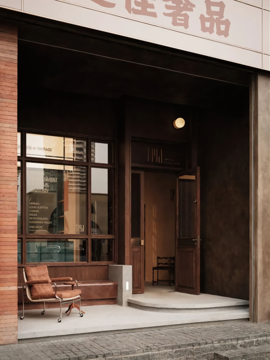
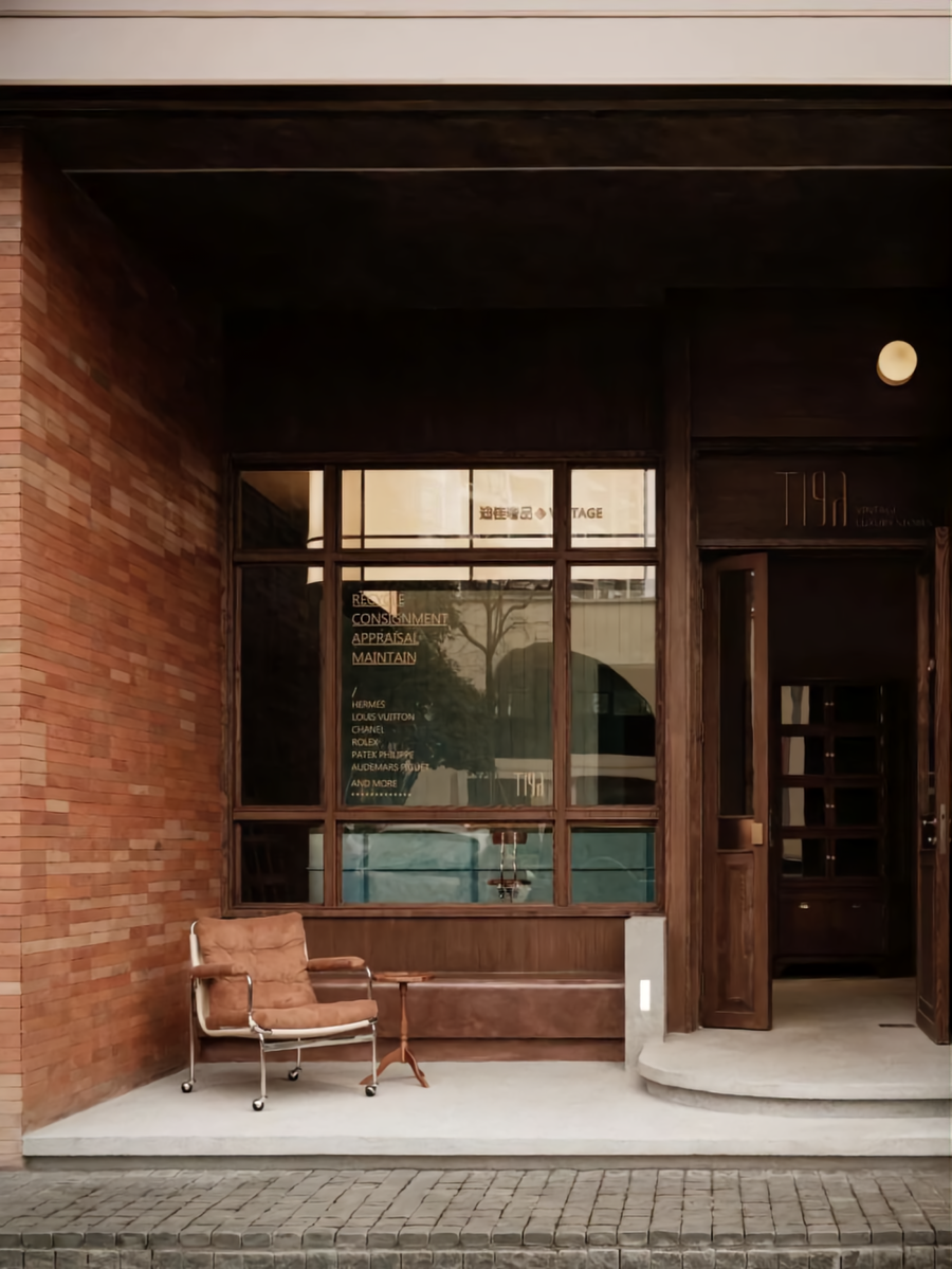
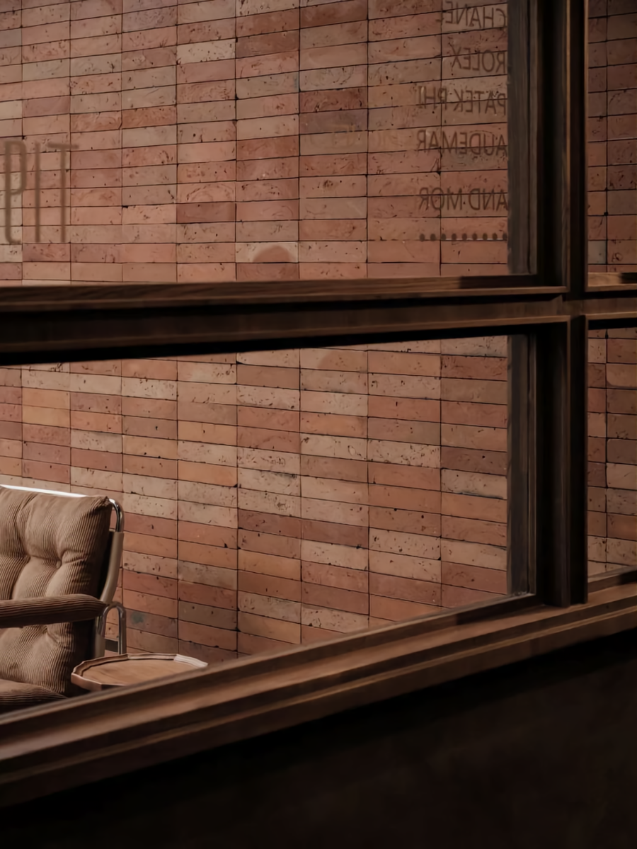
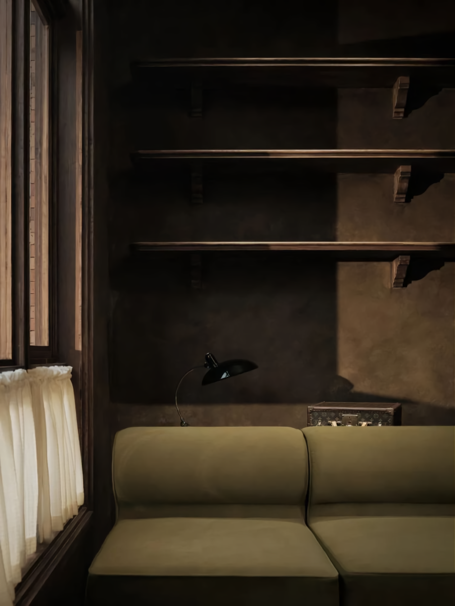
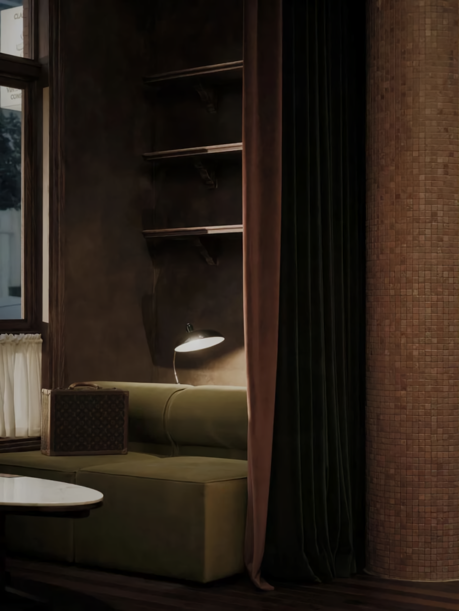
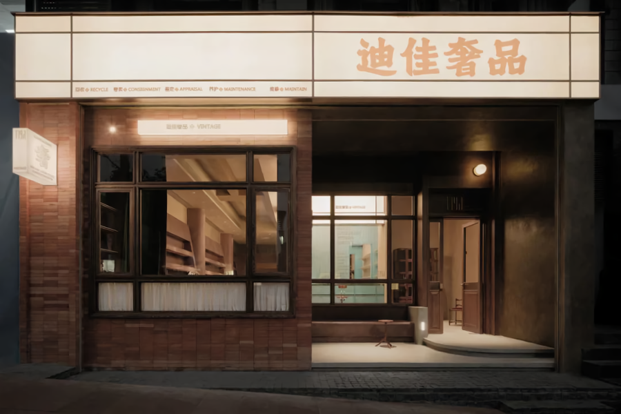
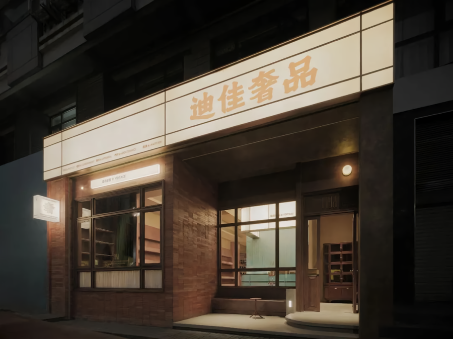
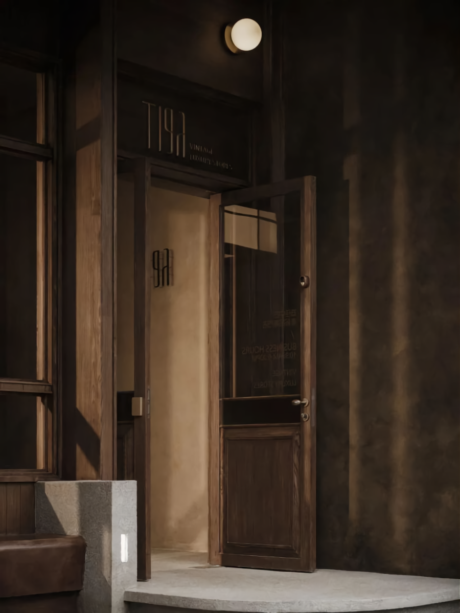
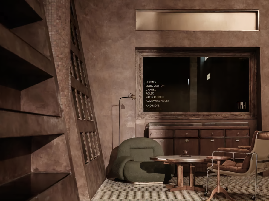
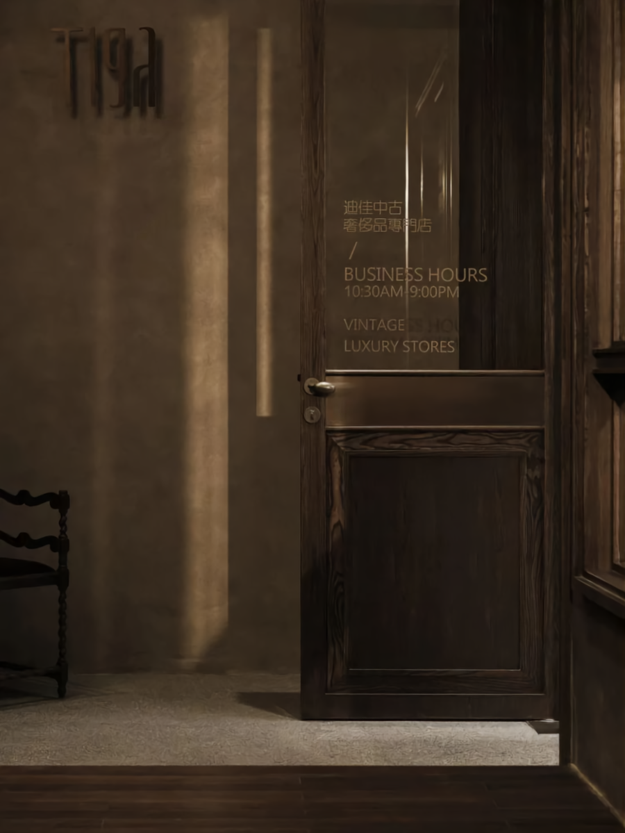
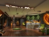
首先根据所处地形因素,我们将门头分成了两个空间,并实施了部分地面抬高的土建处理。右边部分以退后的方式形成了内外门厅的关系。这样的处理不仅让外部空间的关系更加丰富,也通过交通动线的设置,弱化了其C字型的建筑结构关系。而左边部分则被做成了封闭的休闲区域,该区域不仅满足于休闲洽谈的使用,较大的玻璃装饰窗的设置,也将作为橱窗的功能引导过往的游客看进来。同时,这样的处理,还能完美地解决因室外坡度关系所埋下的雨水倒灌的隐患。
First of all, according to the terrain factors, we divide the door head into two spaces and partial ground elevated by the civil engineering treatment. The right part is in a backward mode to form the relationship between the inside and outside foyer. The management not only makes the relationship of external space plentiful but also weakens the “C” shape building structure by the setting of the pathway. When the left part is created into a closer rest part, it does not just satisfy the usage of leisure negotiation, the setting of a relatively larger glass decorative window also can function as a showcase to lead the passing tourists to see inside. Meanwhile, handling like this also can perfectly solve the hidden trouble of rainwater backward flow caused by outdoor slope relation.
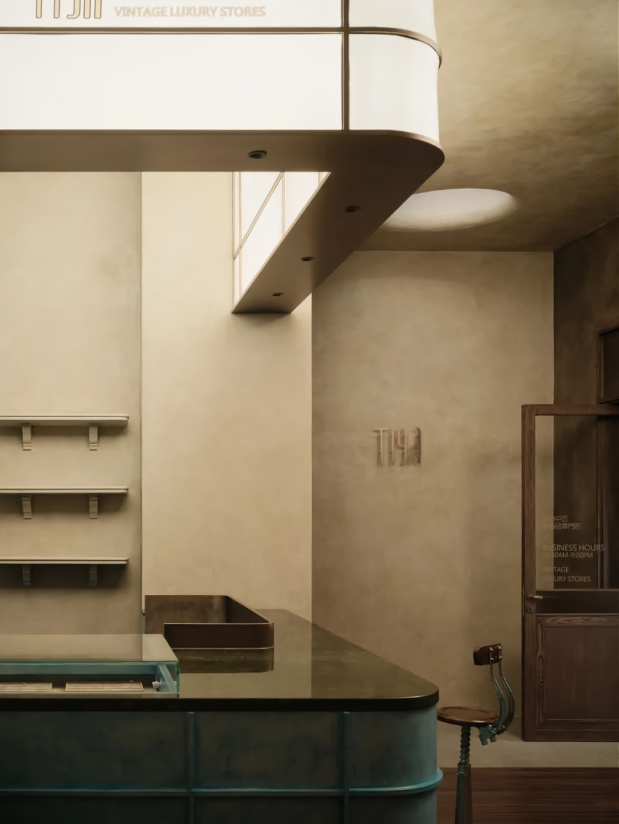
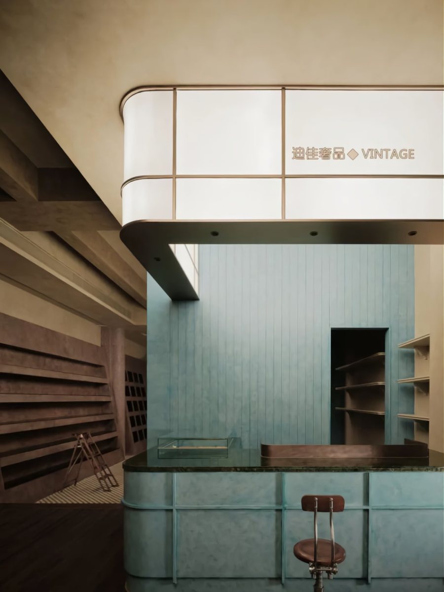
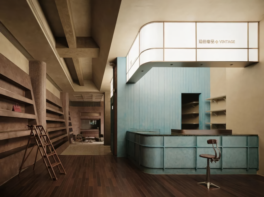
当进入到主体空间后,我们通过抬高地台的方式,以及结合柱体而形成的围合式综合服务空间,将室内主要展示空间又分为了两个主要部分。前端部分为主要的对外展示及服务区域。在这个空间里,我们将综合服务台、箱包陈列、休闲洽谈空间融为一体,这样的设置,能让消费者最为快速地感受到该商店所要展现给他们的服务内容、美学标准、以及对话的可能性。这无疑是满足销售诉求与客户快速认知的最佳表达方式。
After entering the main area, we apply the method of raise the platform, and the enclosed comprehensive service space formed by combining the columns, divide the inside main exhibition area into two major parts. Front part is principle external display and service area. In the space, we combine the integrated service desk, luggage display and Leisure negotiation part. This kind of setting can let consumers feel the service content, aesthetic standards and the possibility of dialogue that the store wants to show them most quickly. Undoubtedly, this is the best expression to satisfy sales demands and customers' quick cognition.
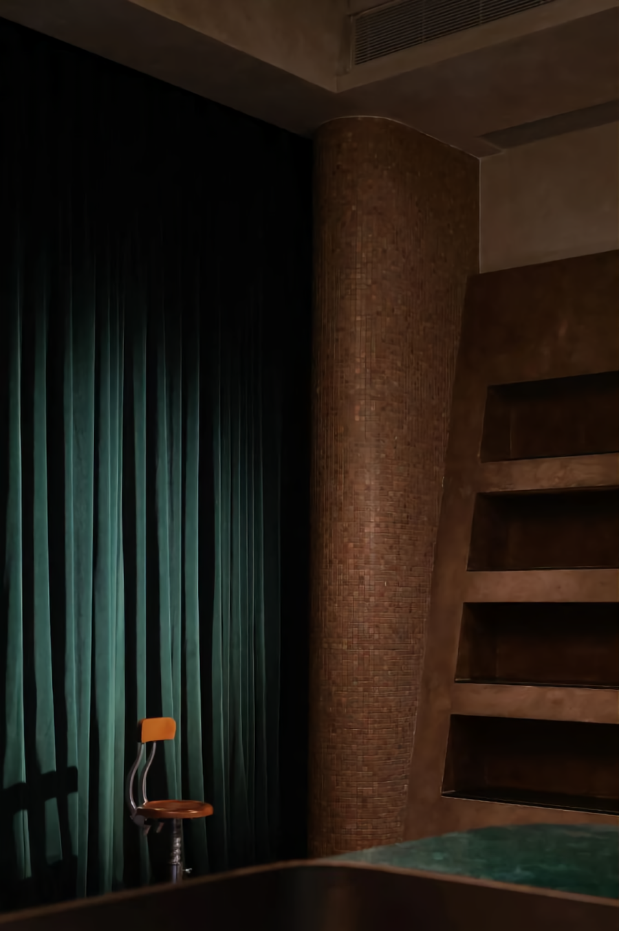
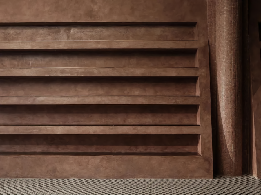
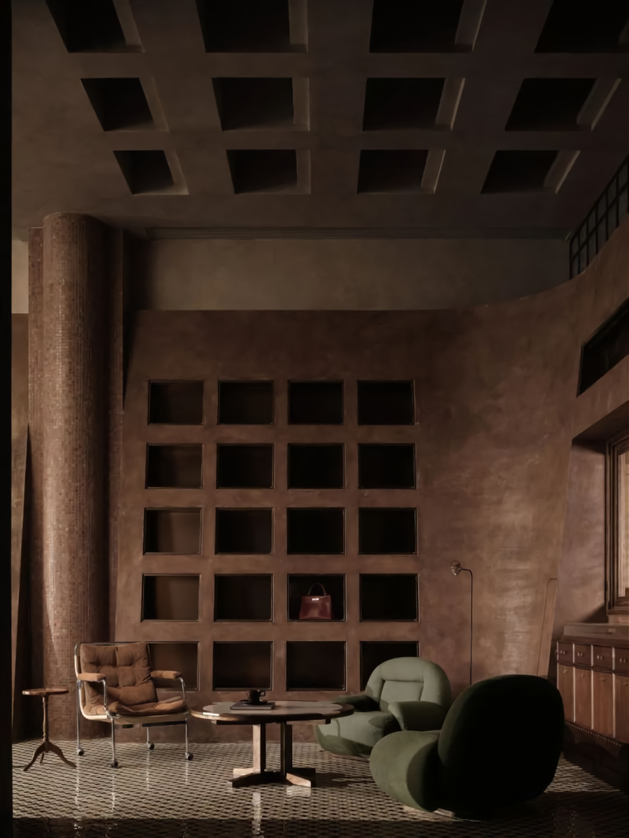
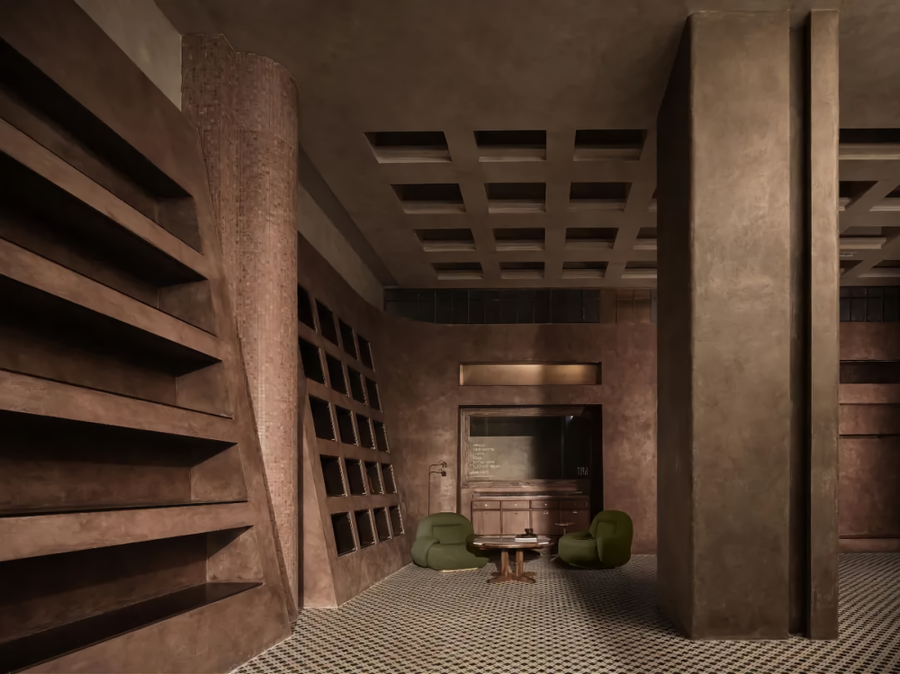
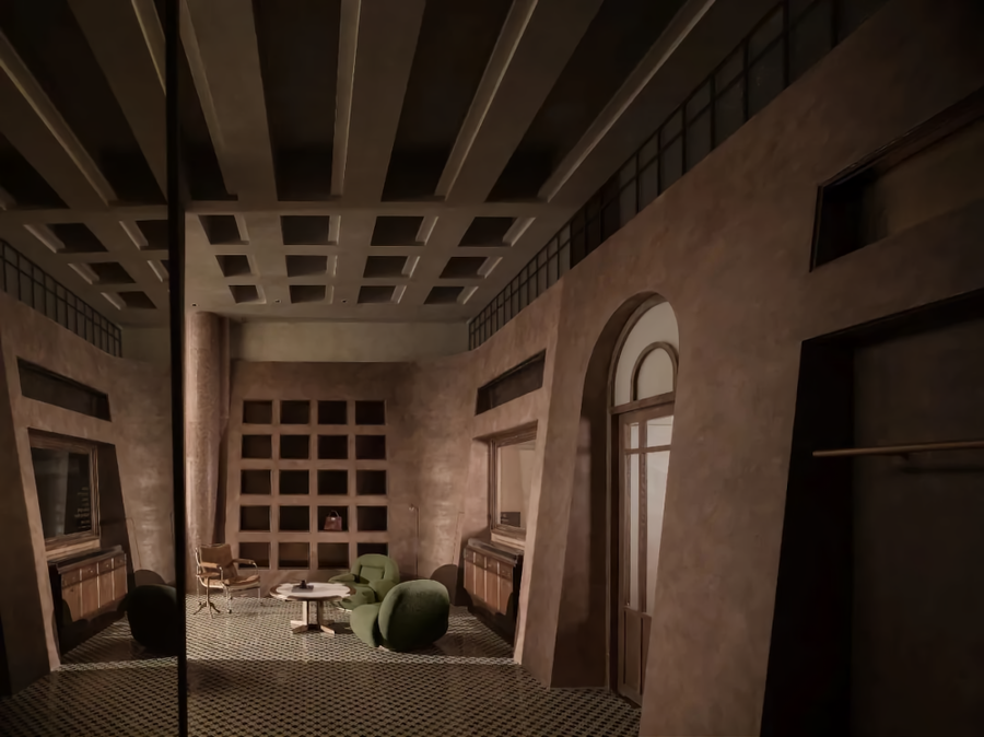
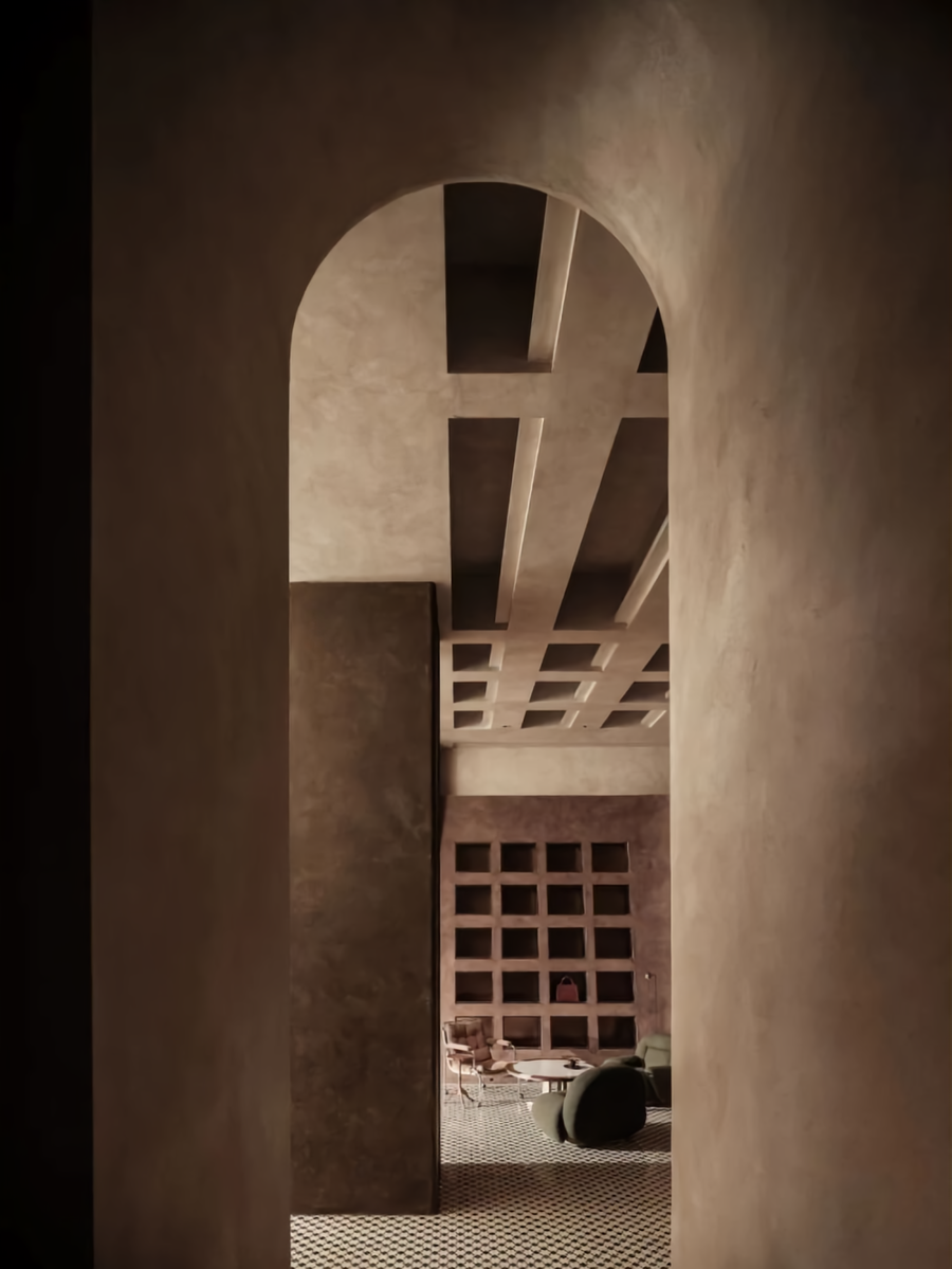
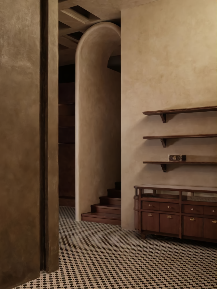
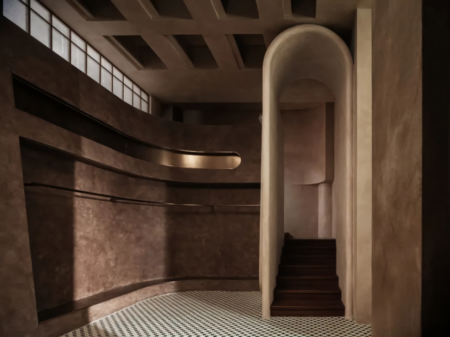
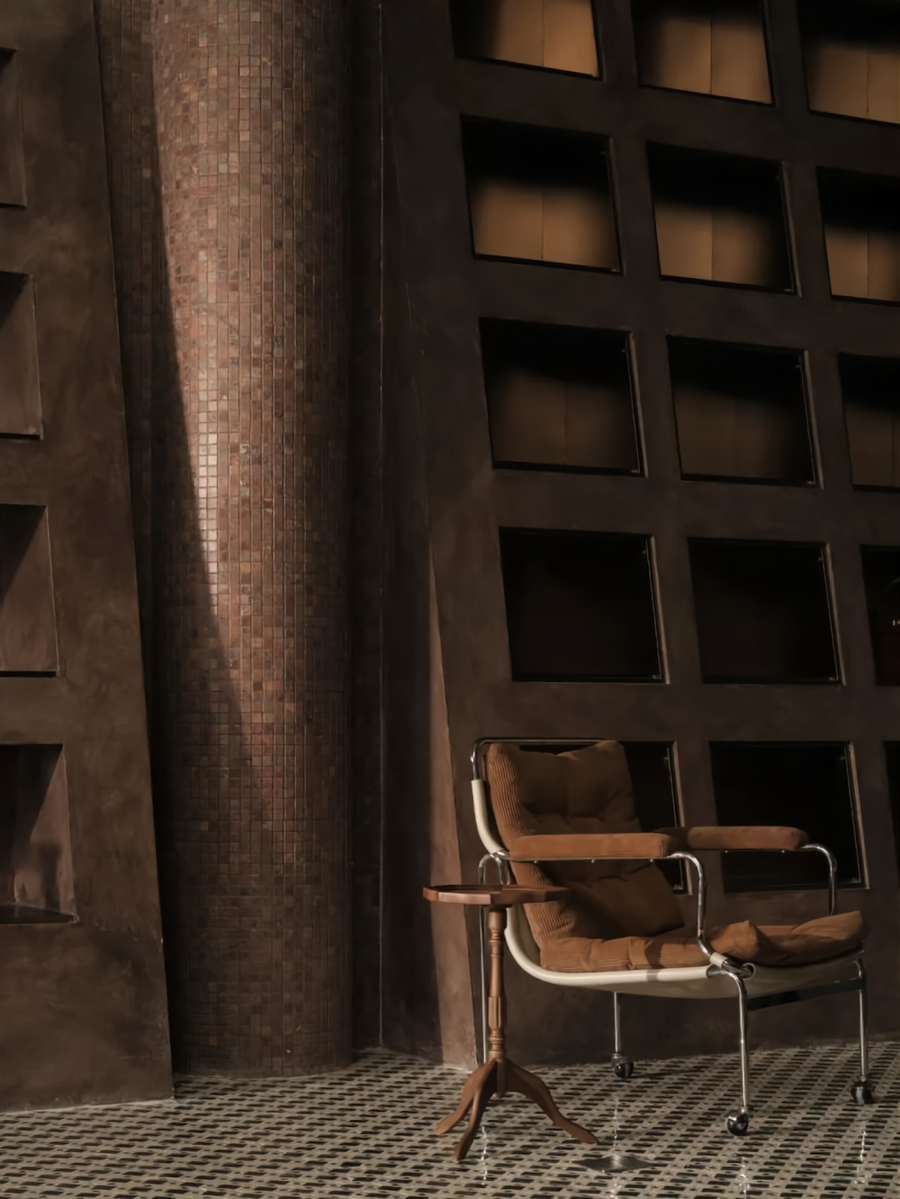
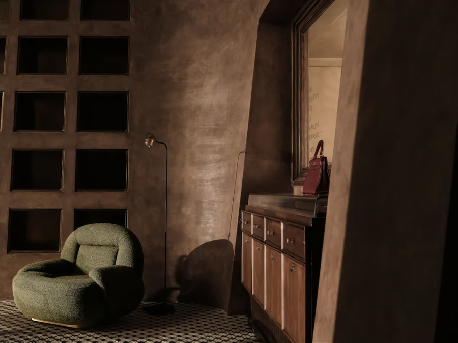
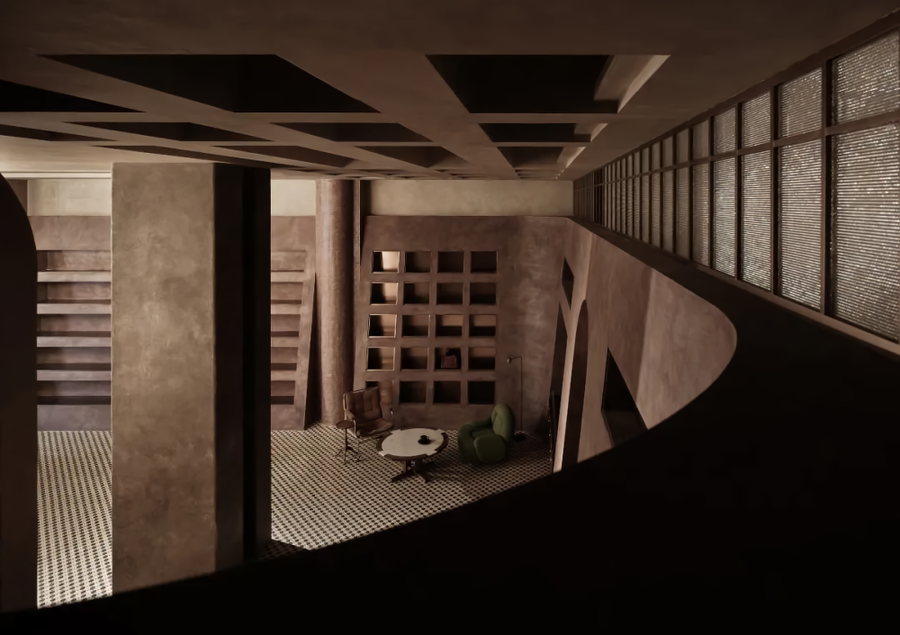
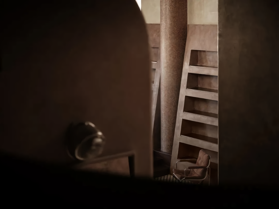
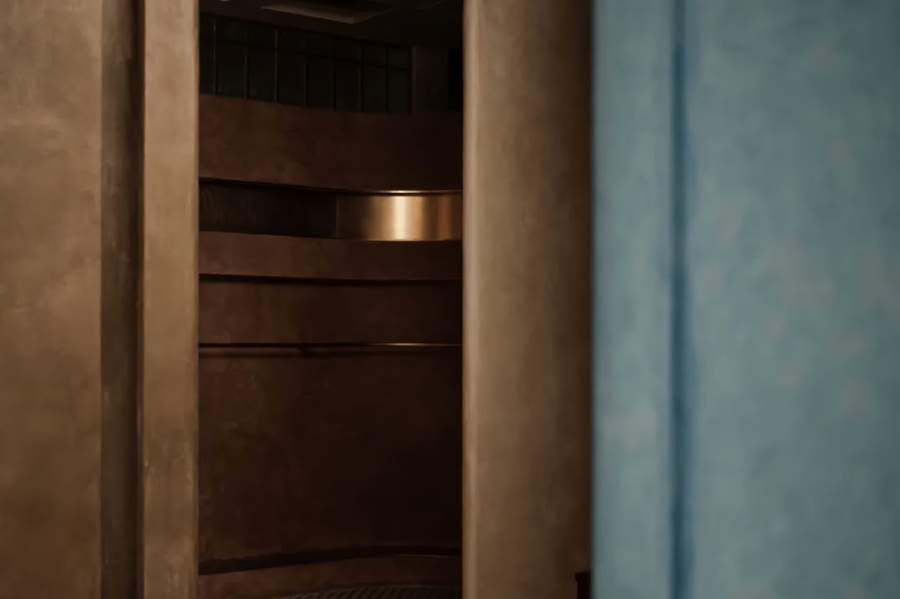
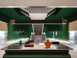
再往里走,则是我们可以营造的精神场域。原本可以搭建为两层空间的层高关系得以保留。在这里,高挑的结构柱与箱包陈列墙成为了视觉的主体。低趴的座位区与之形成鲜明的对比。而这种反差,正是我们想要营造的姿态。这与重庆这座城市的姿态不无关系。夸张的楼梯入口与造型门窗,则暗示着,仍有我们可以探知的神秘空间。
Walking further inside is the spiritual field that we can build. The story height relationship that could have been built as a two-story space has been preserved. Here, tall structural columns and luggage display walls have become the main body of vision. The low-lying seating area is in sharp contrast with it. And this contrast is exactly what we want to create. It is highly related to the posture of Chongqing. Exaggerated stair entrance and modeling doors and windows imply there still contain the mysterious area we can explore.
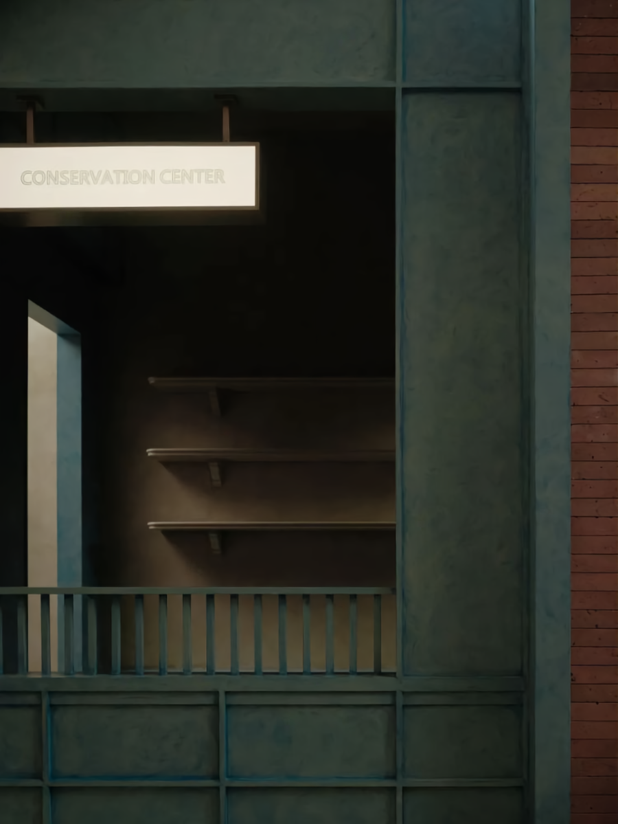
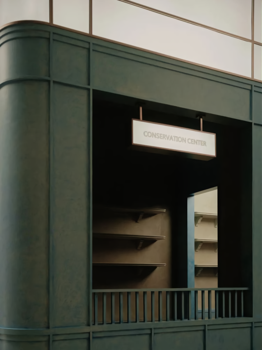
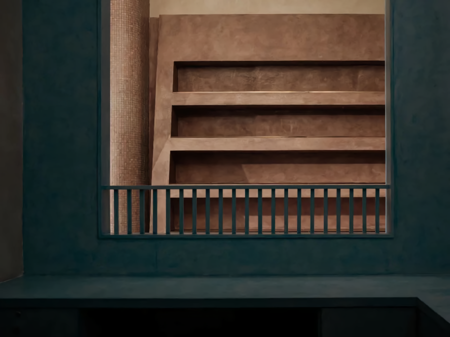
因其较为狭长的建筑结构关系,我们利用最末端的建筑部分进行了双层空间的搭建。这不仅是为了更好地营造空间情绪而产生的设计手段。更是为了保证更好的实际使用诉求。一层末端的部分被划分为了VIP接待室、直播间、储藏间、以及卫生间的功能关系。而二层部分的设置,不仅是满足了主理人与员工的办公、收纳,也通过一个楼道的搭建,为狭长的建筑空间画上了一个开放性的句号。这种结束的状态,能让消费者身处其中时,有更多的画面感与参与感。当然,这也有效地丰富了其空间关系,让购物体验更加丰满。
Because of the relatively narrow deep building structure relationship, we build the double-layer space by using the end of the architecture. This is not only a design method to create space mood better. But also to ensure better practical use demands. The part at the end of the first floor is divided into a VIP reception room, live broadcast room, storage room and toilet. The setting of the second floor not only satisfies the office and accommodation of the manager and staff but also draws an open end to the narrow building space through the construction of a corridor. This ending state can make consumers feel more picture and participation when they are in it. Of course, it effectively rich the space relationship, makes the shopping experience fuller.
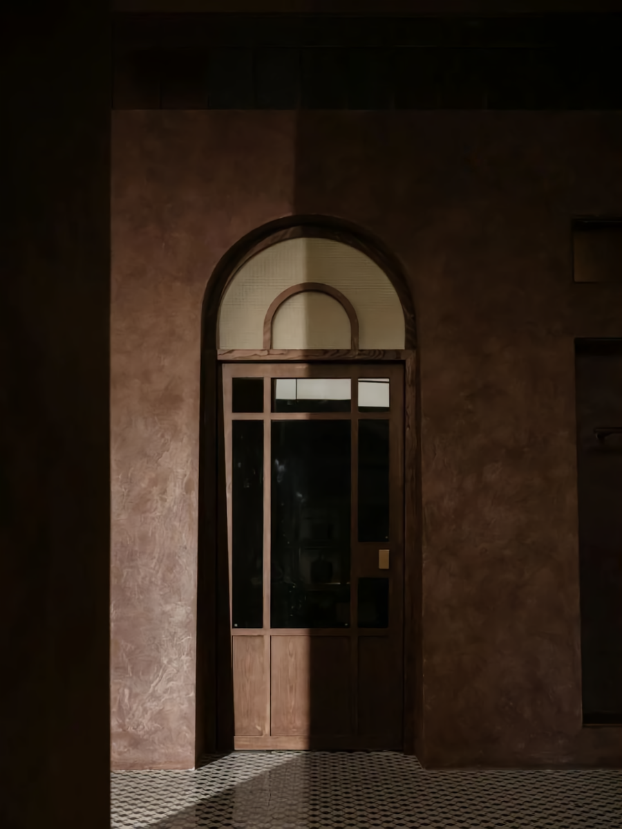
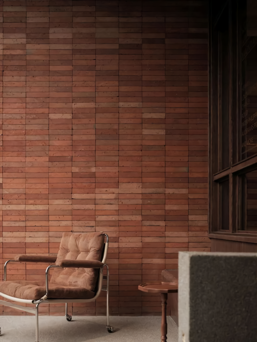
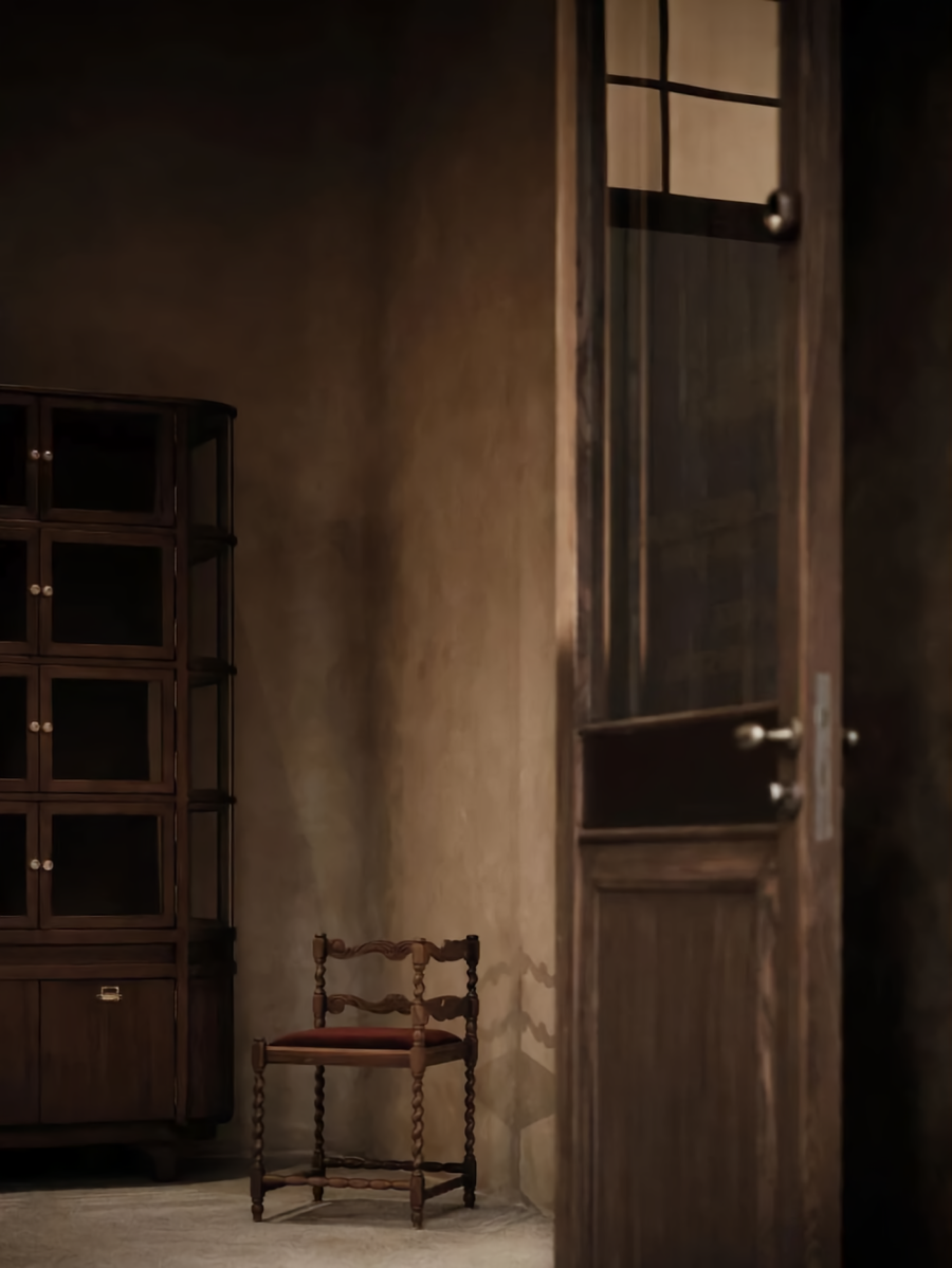
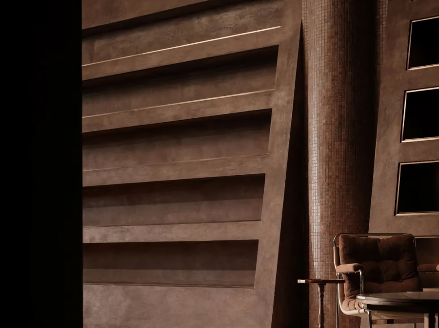
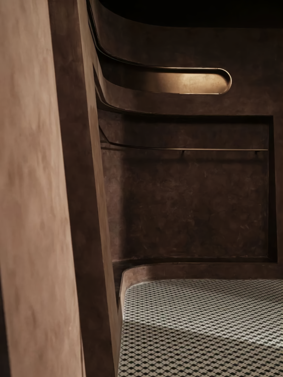
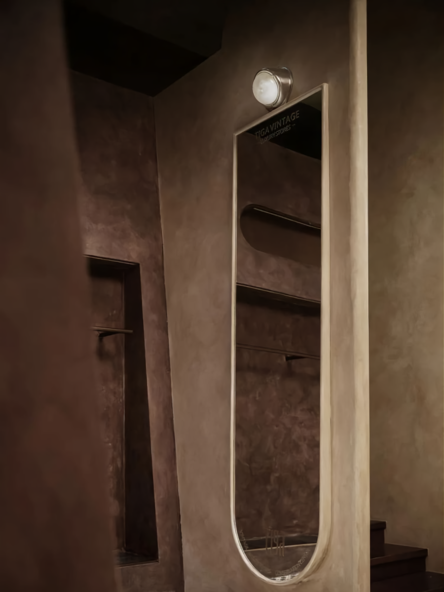
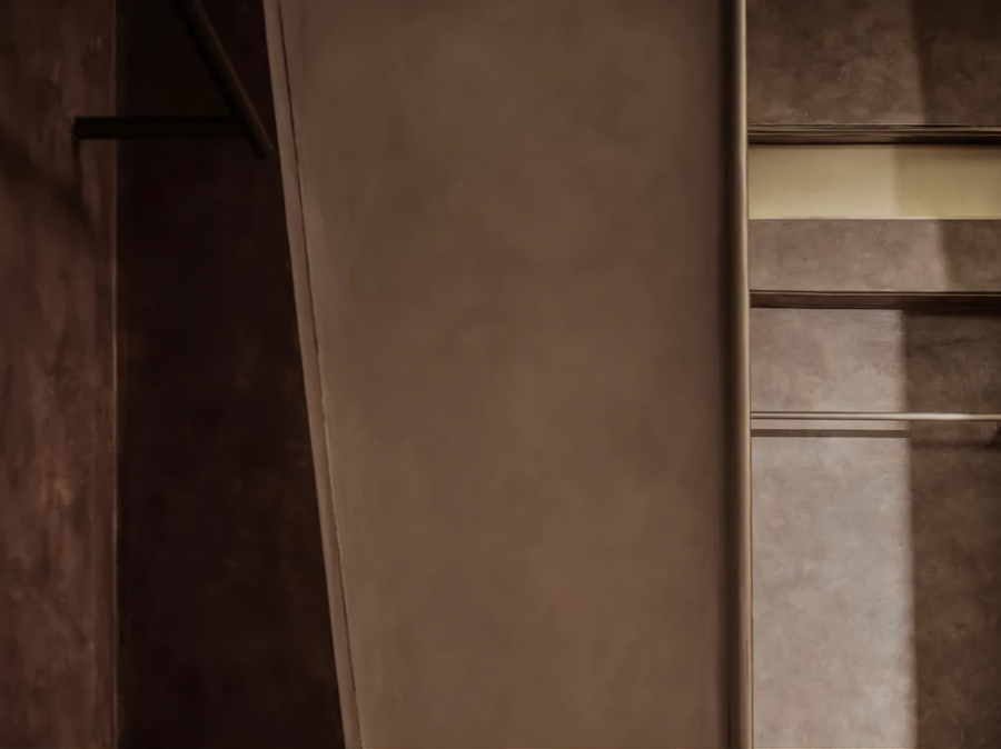
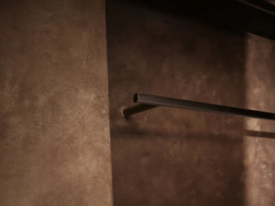
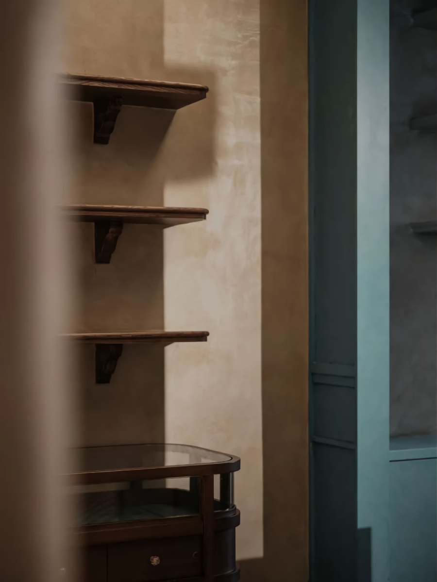
质感表达Texture Expression-在质感的表达上,我一如既往的偏爱着最为基础的材质关系。原木、水洗石、涂料、红砖再次成为了空间的主角。这无疑是最为纯粹的表达形式。但在迪佳的价值输出方面,我们希望较之以往的同类作品,更具传统价值的认知感受。所以,在整体的设计中,我们融入了适度的石材、短绒、拼花、金属等材质。特别是在软装陈设的选择上,价值感进一步提升。精致的做工、考究的五金、以及稀缺的面料,都为品质的保证奠定了基础。
On the texture expression, as always, I prefer the most basic material relationship. Log, washed stone, paint and red brick have once again become the key to space. No doubt, it is the purest expression formation. But in Dijia’s value output aspect, we hope to have more traditional cognitive feelings than previous similar works. So, in the overall design, we incorporate moderate stone, short pile, mosaic, metal, and other materials. Especially in the choice of soft furnishings, the sense of value is further enhanced. Exquisite workmanship, exquisite hardware, and scarce fabrics have laid the foundation for quality assurance.
虽然这看似老旧的质感关系,并非光鲜亮丽。但,这便是我所希望呈现出来的空间。可以安静地、平和地屹立在那里。伴随着时间、光影、人物的关系,而自在其中。每一刻,即是一帧,即是可以保存起来的当下。
Although the texture relationship seems old not glamorous. However, it should be the space I want to show. It can still in peaceful and clam. Among them, accompany with the relationship of time, light and shadow, character. Every moment is a frame, that is, the moment that can be saved.
项目信息
Information
项目名称:迪佳中古奢侈品商店
Project Name: Tiga Luxury Vintage Store
项目地点:中国重庆
Project Location: Chongqing, China
设计总监:文超
Design Director: Steven
设计团队:JSD - 简璞设计
Design Team: JSD
软装设计:JSD - 璞本文致
Soft Loading Design: JSD
装饰工程:JSD - 璞造建设
Decoration Engineering: JSD
建筑面积:240平方米
Cover Area: 240 m²
空间摄影:言隅建筑摄影
Space Photography:Inspace Photography







评论(0)